
SKELTCH
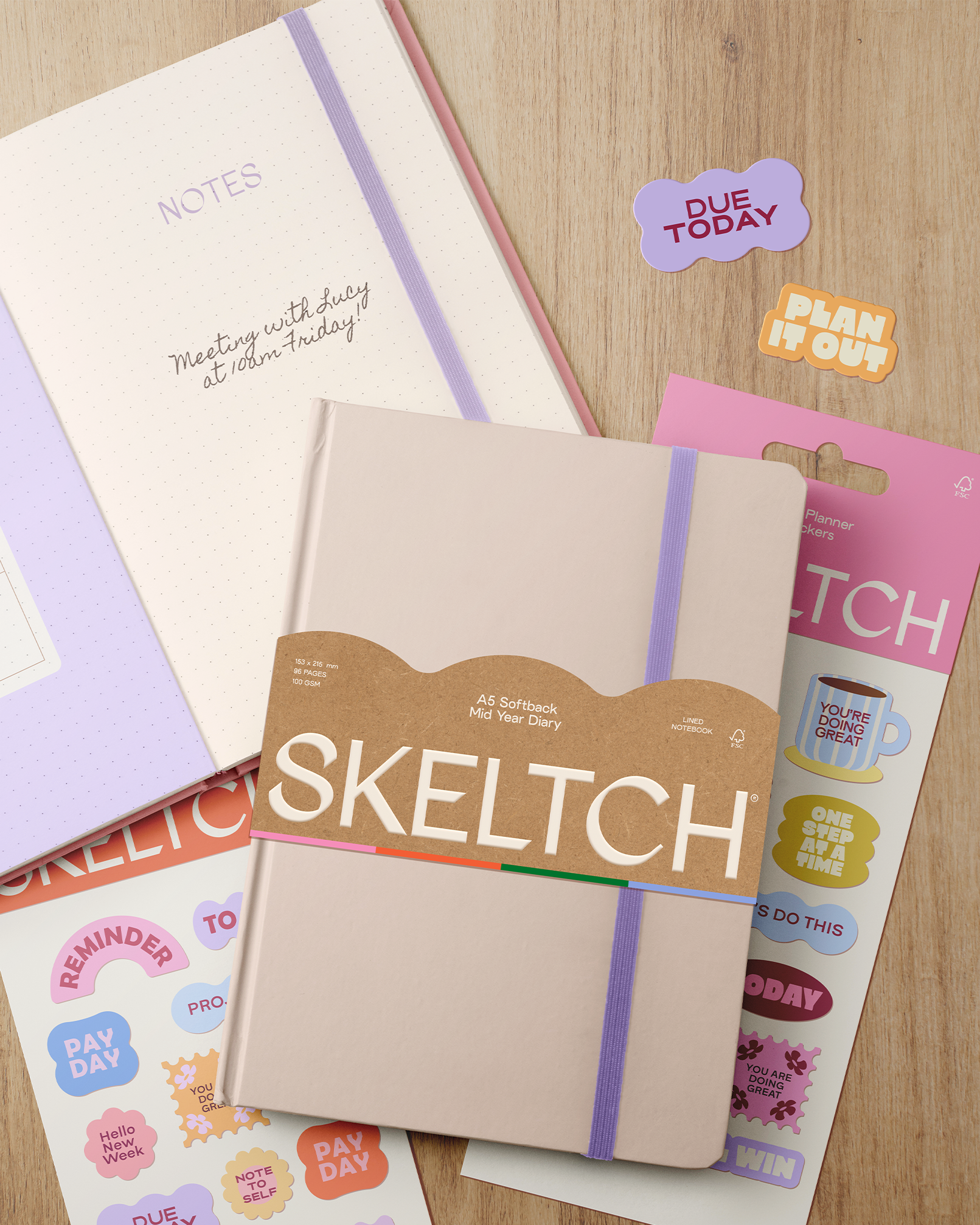
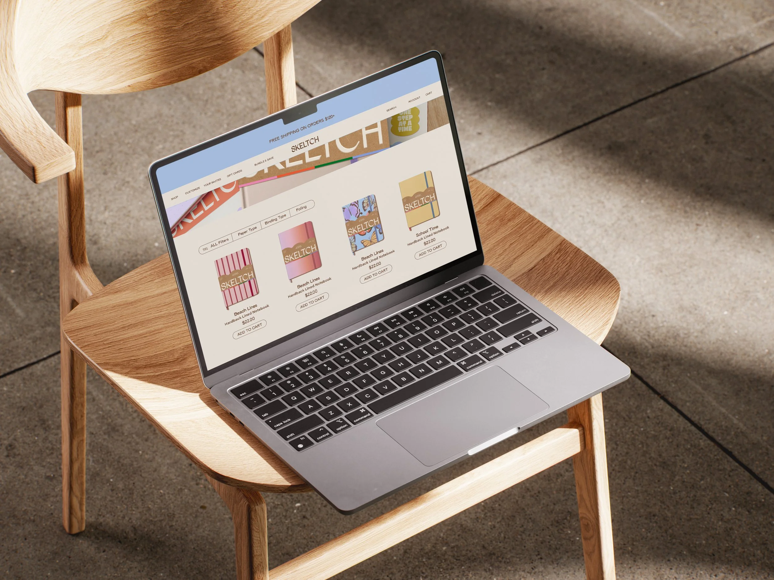
SKELTCH is a stationery brand created for creatives, dreamers, and anyone who loves making plans their own. The idea was to bring a fresh, colorful approach to everyday organization, combining functional stationery with a visual identity that feels personal, playful, and full of character.
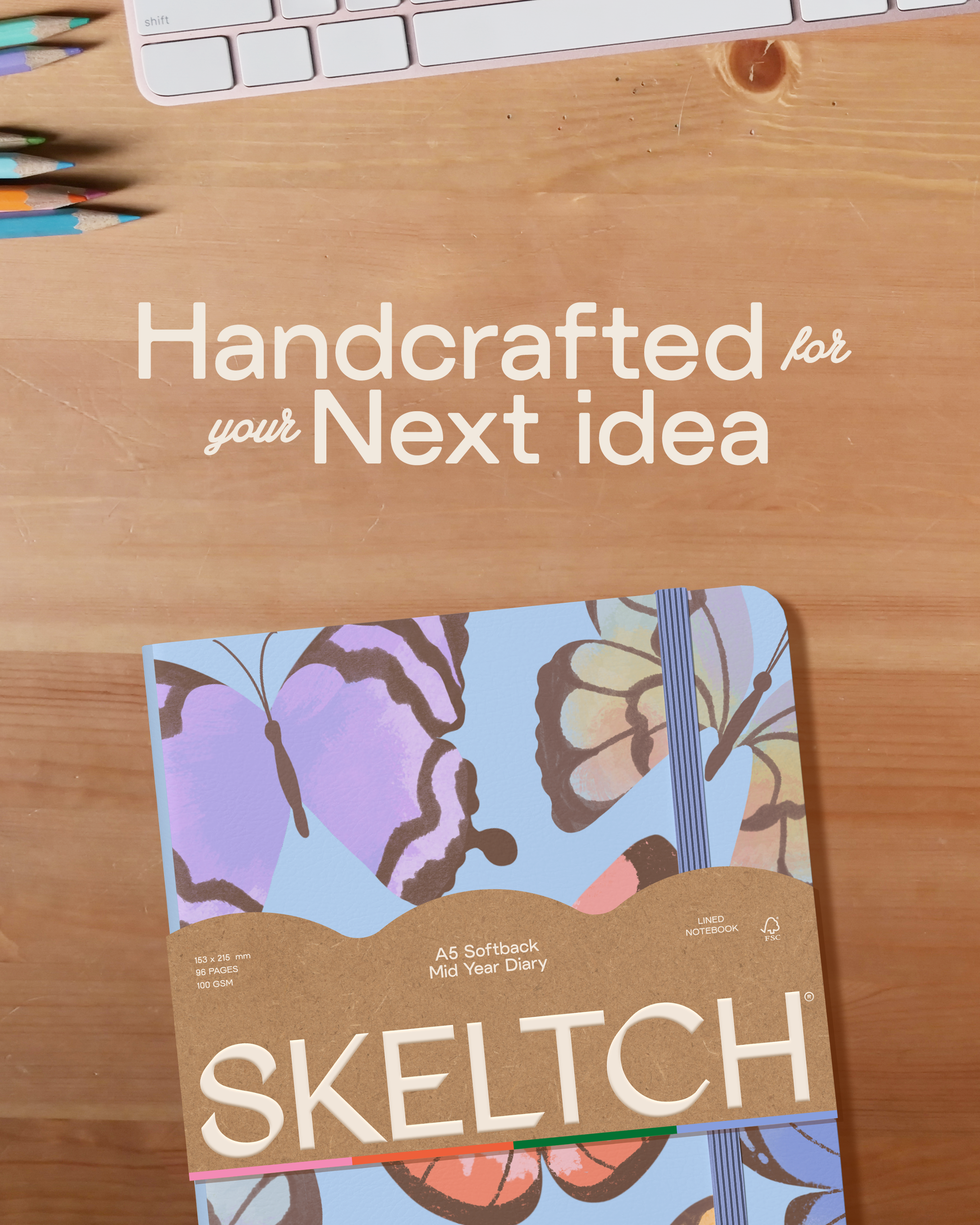
The visual direction explores the balance between structure and spontaneity. Clean layouts and modern typography provide a foundation for expressive butterfly illustrations, playful patterns, and unexpected color combinations.
Together, these elements give SKELTCH a recognizable visual world that feels organized without being too serious.
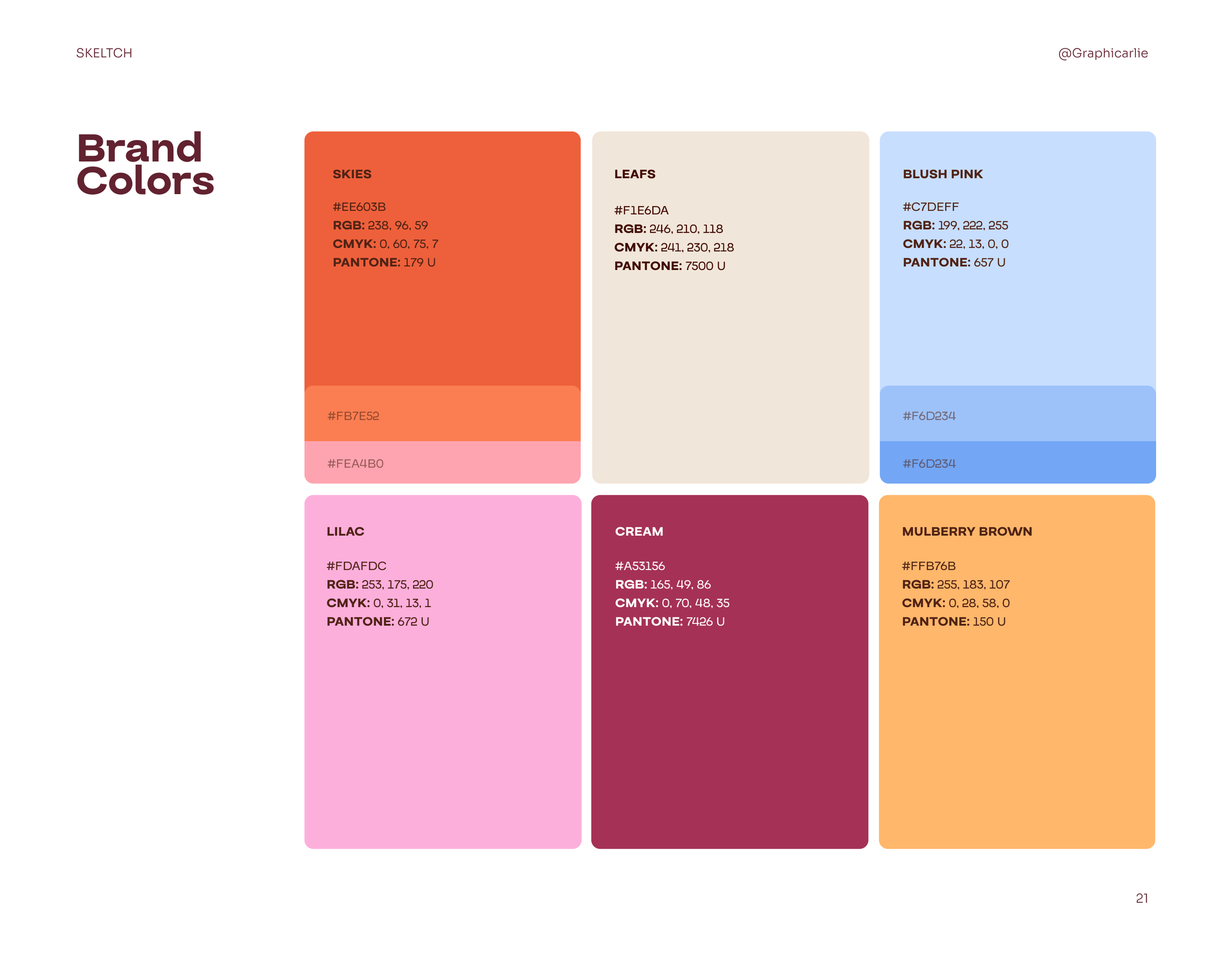
JAMMED’S color palette
For JAMMED, I wanted to build a brand that could stand out from the category. The direction combines playful colors and bold typography with a clean, editorial approach, giving the brand a look that feels fun, confident, and a little unexpected.
A chunky, bold logotype gives JAMMED its distinctive personality. The tight lettering makes the name feel compact, confident, and hard to miss.
A clean, modern sans-serif logotype keeps the identity simple and recognizable, allowing the illustrations and patterns to take the spotlight without overwhelming the overall design.
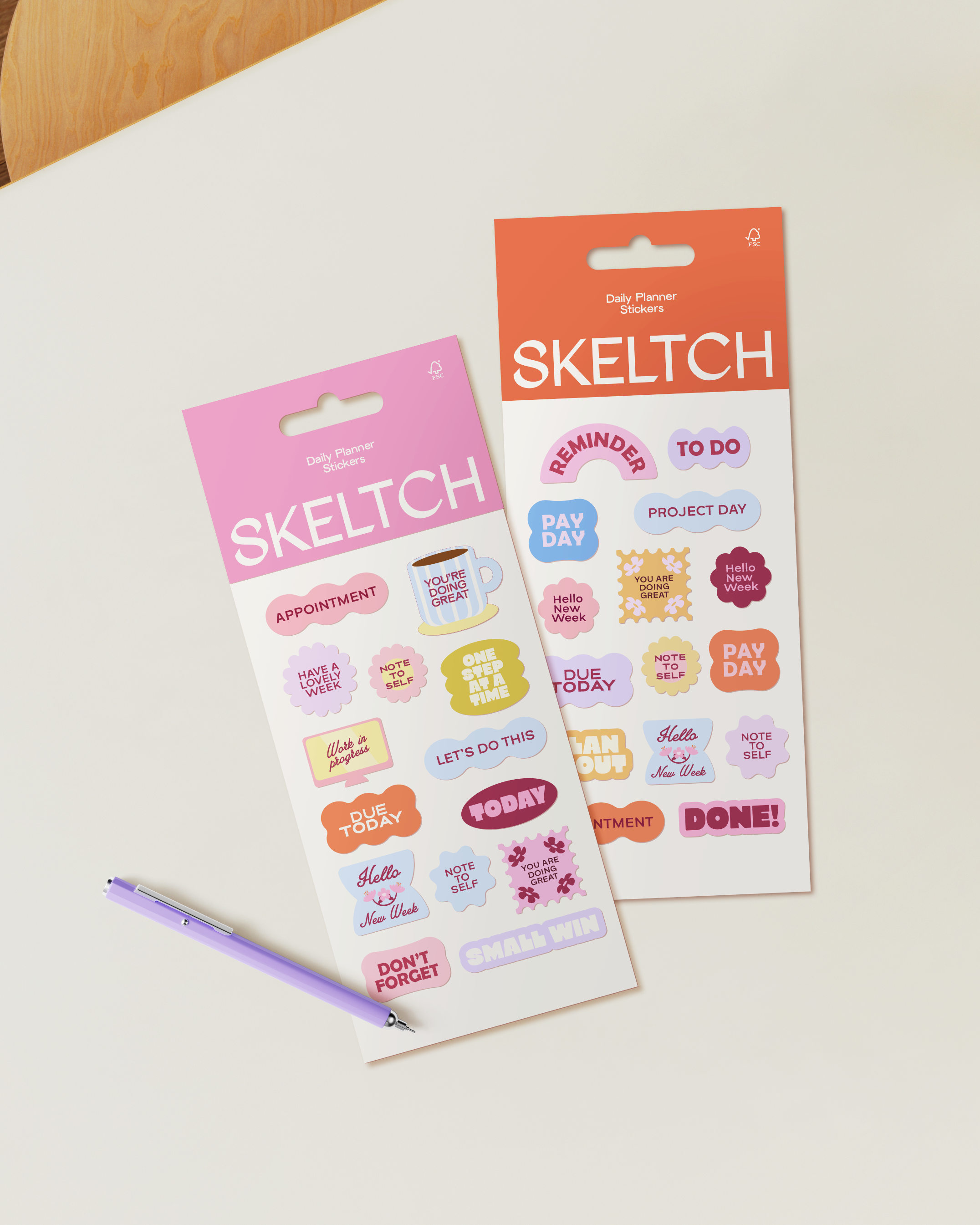
The result is a stationery identity that brings together thoughtful design and everyday functionality, turning planners, stickers, and paper goods into a cohesive and colorful brand experience.
Deep berry tones, electric bubblegum pink, and warm cream bring a fresh twist to the category. The contrast feels vibrant and playful while keeping the overall identity polished.
Bold typography, abstract fruit shapes, and clean editorial details come together to create a packaging system that feels simple but full of character.
Check out more projects!
L’IRON →
POSDATAS DE ISA →