
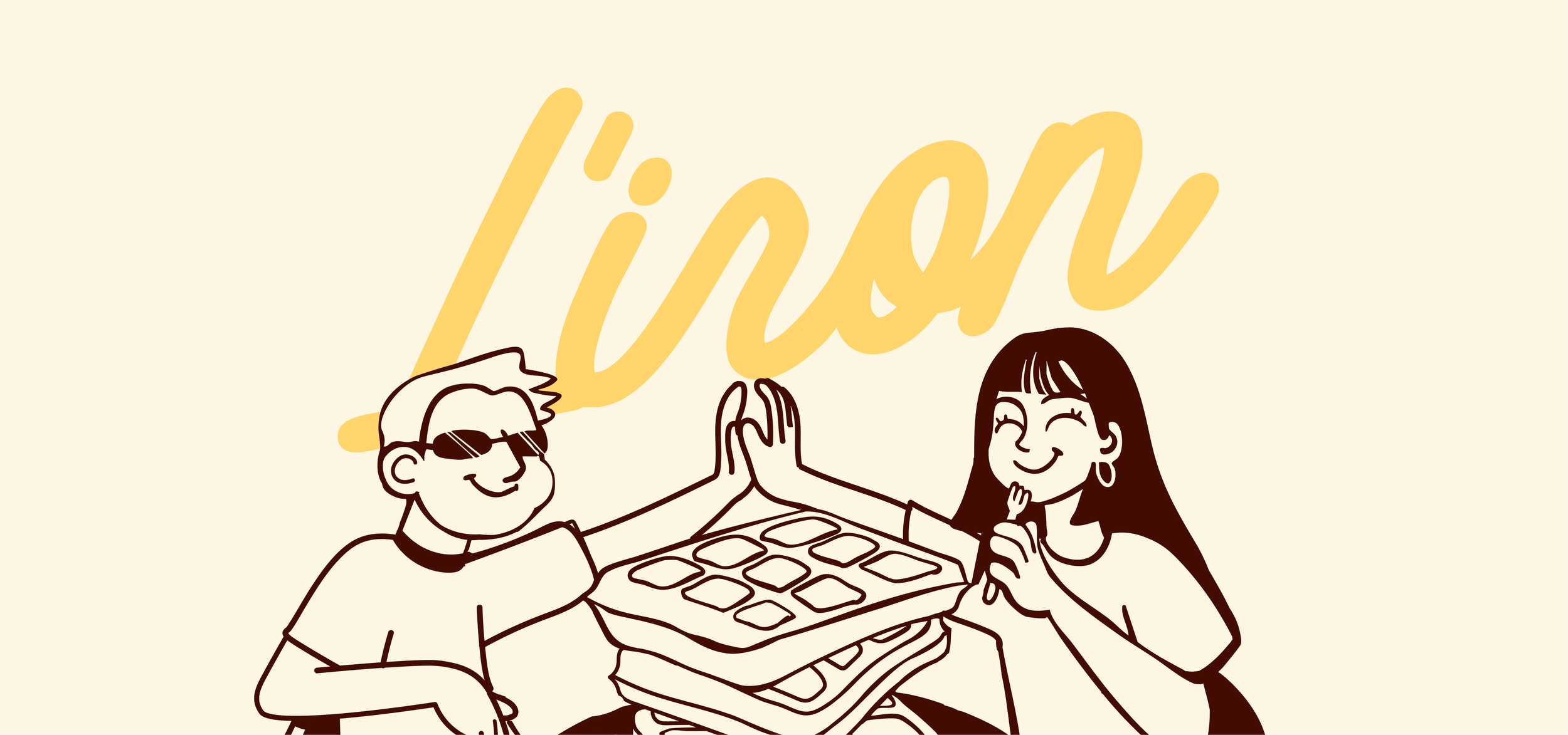
L’IRON’S logo
For JAMMED, I wanted to build a brand that could stand out from the category. The direction combines playful colors and bold typography with a clean, editorial approach, giving the brand a look that feels fun, confident, and a little unexpected.
A chunky, bold logotype gives JAMMED its distinctive personality. The tight lettering makes the name feel compact, confident, and hard to miss.
L’IRON
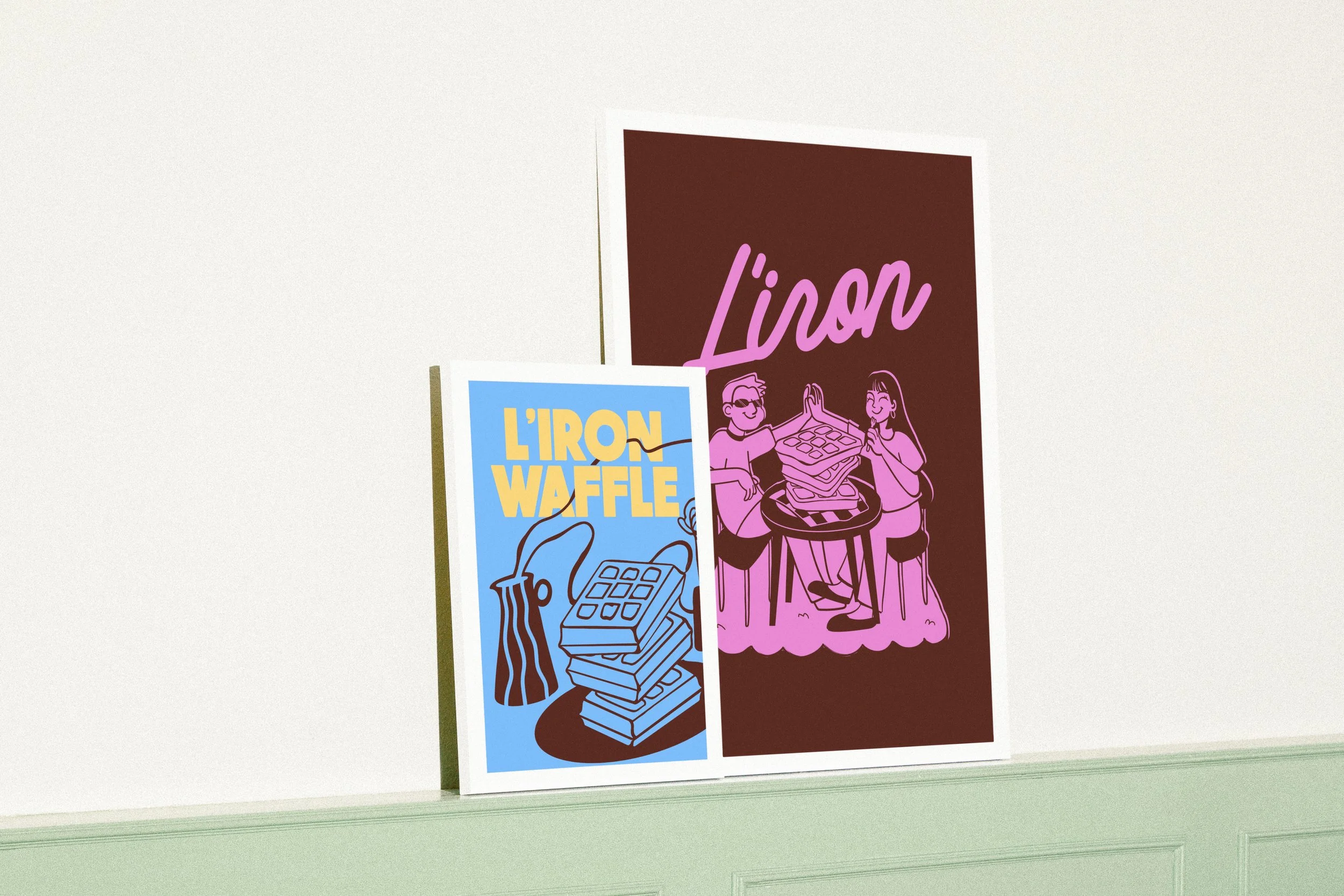
L'iron is a waffle and café brand designed to bring a little fun into everyday routines. Its brand identity revolves around bold typography, bright and vibrant colors, and illustrated scenes featuring characters enjoying waffles and each other's company.
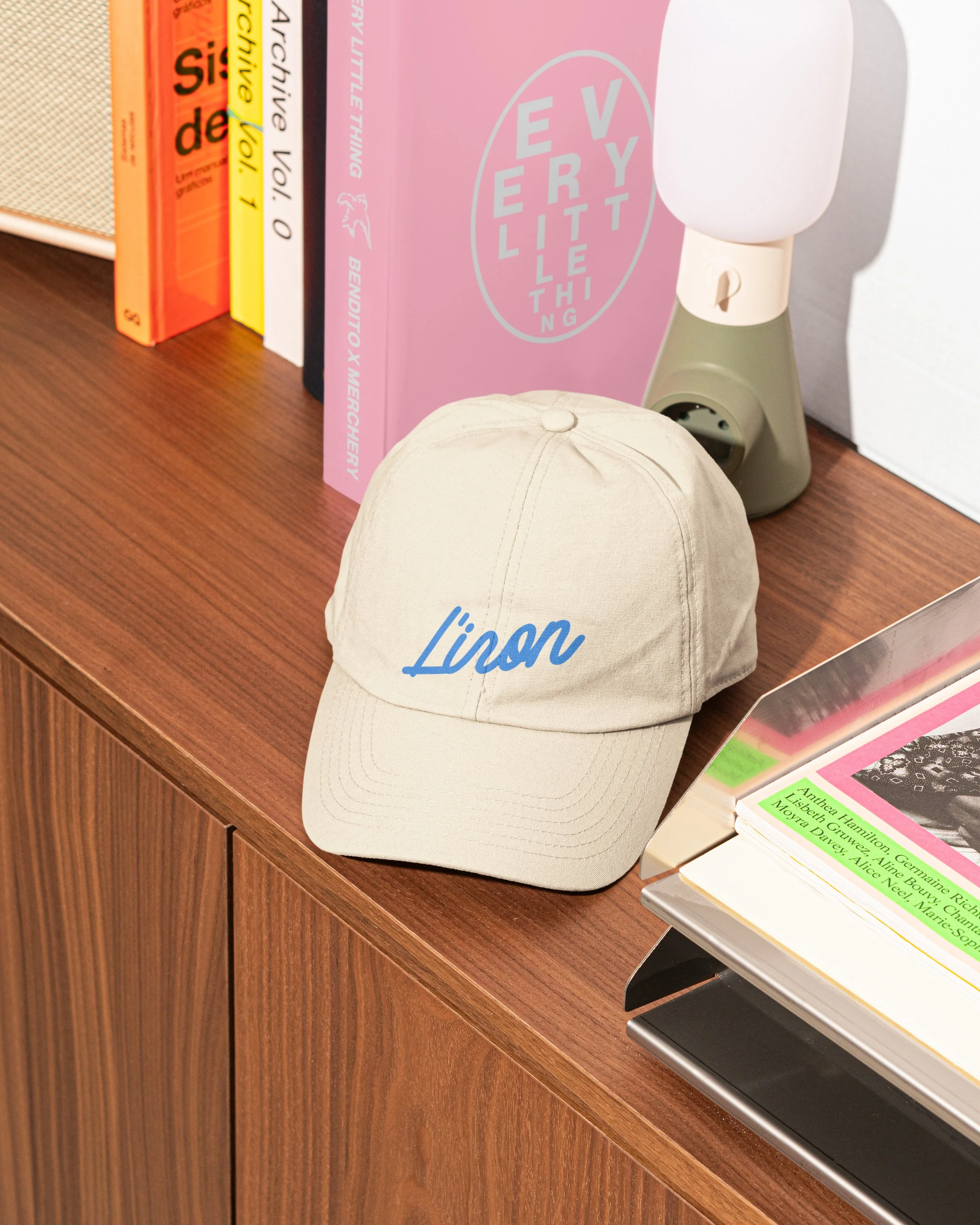
Deep berry tones, electric bubblegum pink, and warm cream bring a fresh twist to the category. The contrast feels vibrant and playful while keeping the overall identity polished.
Bold typography, abstract fruit shapes, and clean editorial details come together to create a packaging system that feels simple but full of character.
I wanted L'IRON to convey a sense of fun while still feeling nostalgic and soft. By incorporating cartoonish characters full of personality, I wanted to create a little world around the product rather than focusing solely on the food itself. The idea was for the world of L'IRON to feel like a ray of sunshine in the middle of an ordinary day.
The illustrations take inspiration from the playful world of cartoons, using expressive characters and organic linework to give L'IRON a more familiar and approachable personality. Rather than simply decorating the packaging, they help bring the brand to life, making it feel like a little world of its own.
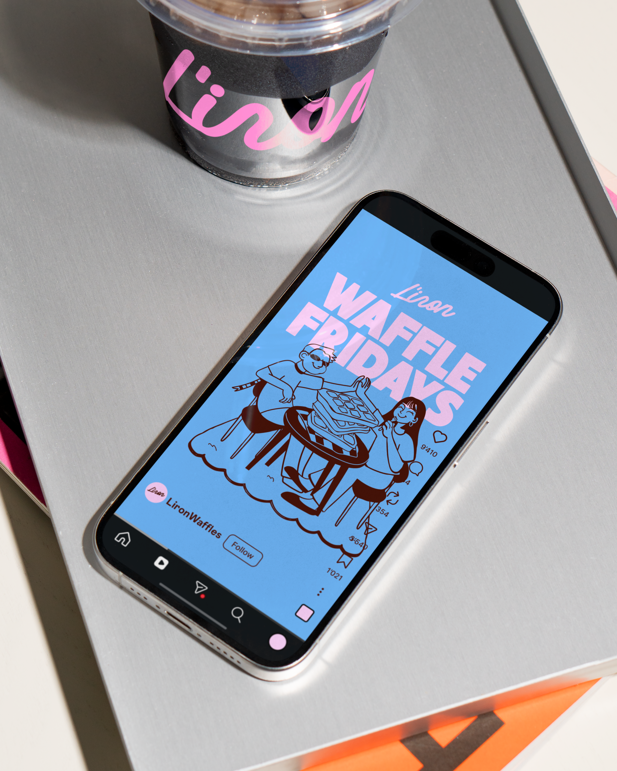
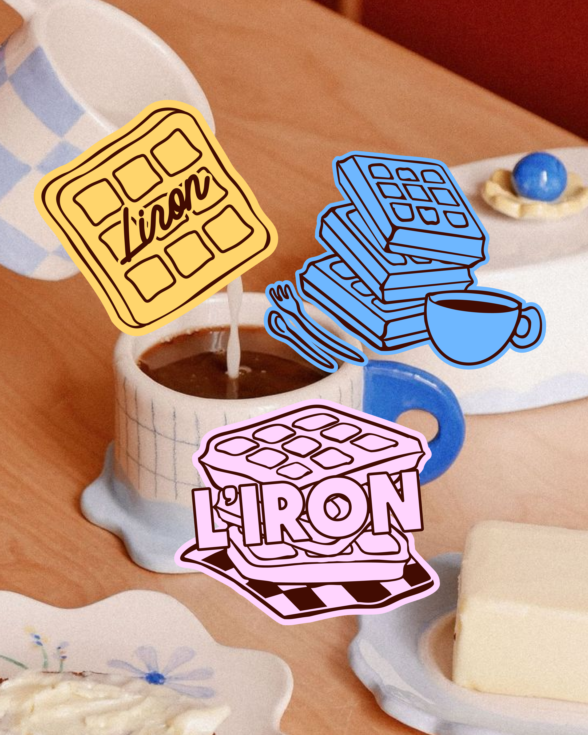
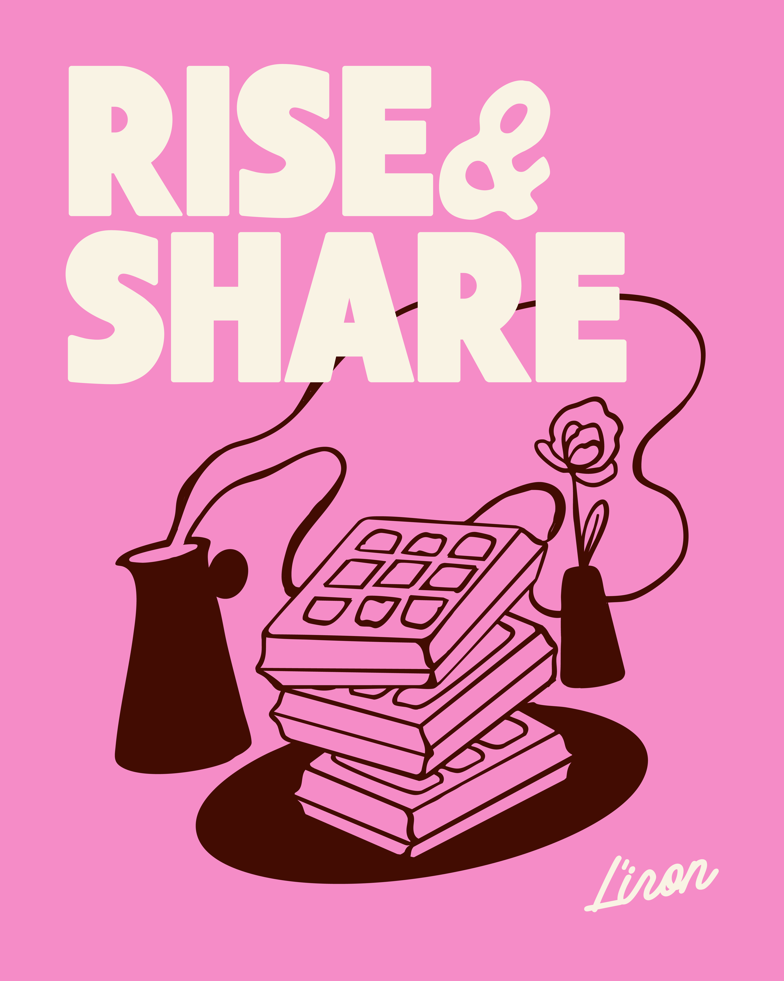
The color palette, revolving around bubblegum pink, sunflower yellow, and striking blue, makes the brand instantly eye-catching. Meanwhile, the combination of a more refined logo typeface and a playful script font brings together a nostalgic vibe with a modern touch.
The overall aesthetic draws inspiration from familiar and nostalgic visual references, while giving them a more contemporary execution.
The goal was to create a visual identity that could translate seamlessly across different brand touchpoints, making every interaction with L'IRON feel like part of the same playful and welcoming world.
Check out more projects!
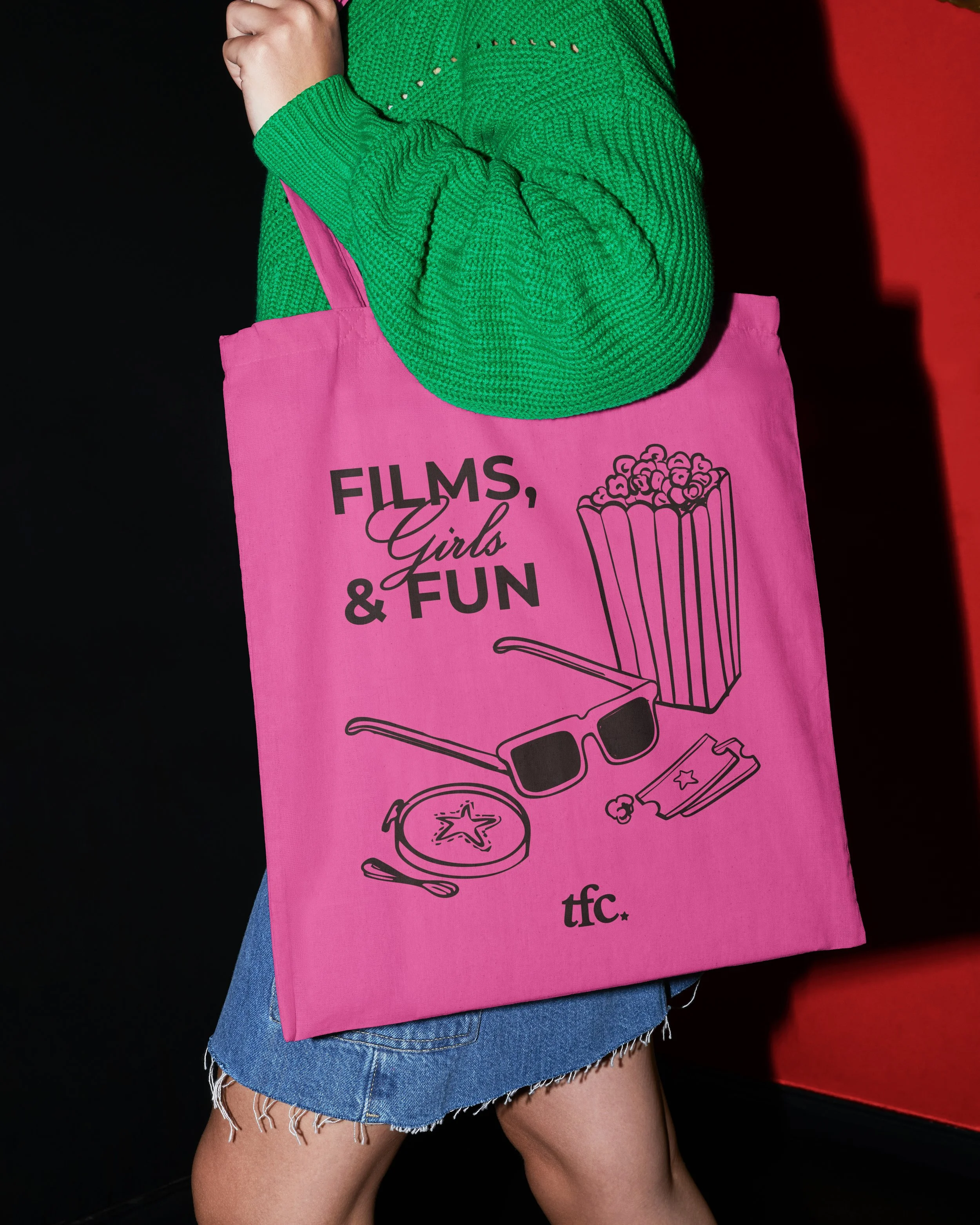
THE FILM CLUB →
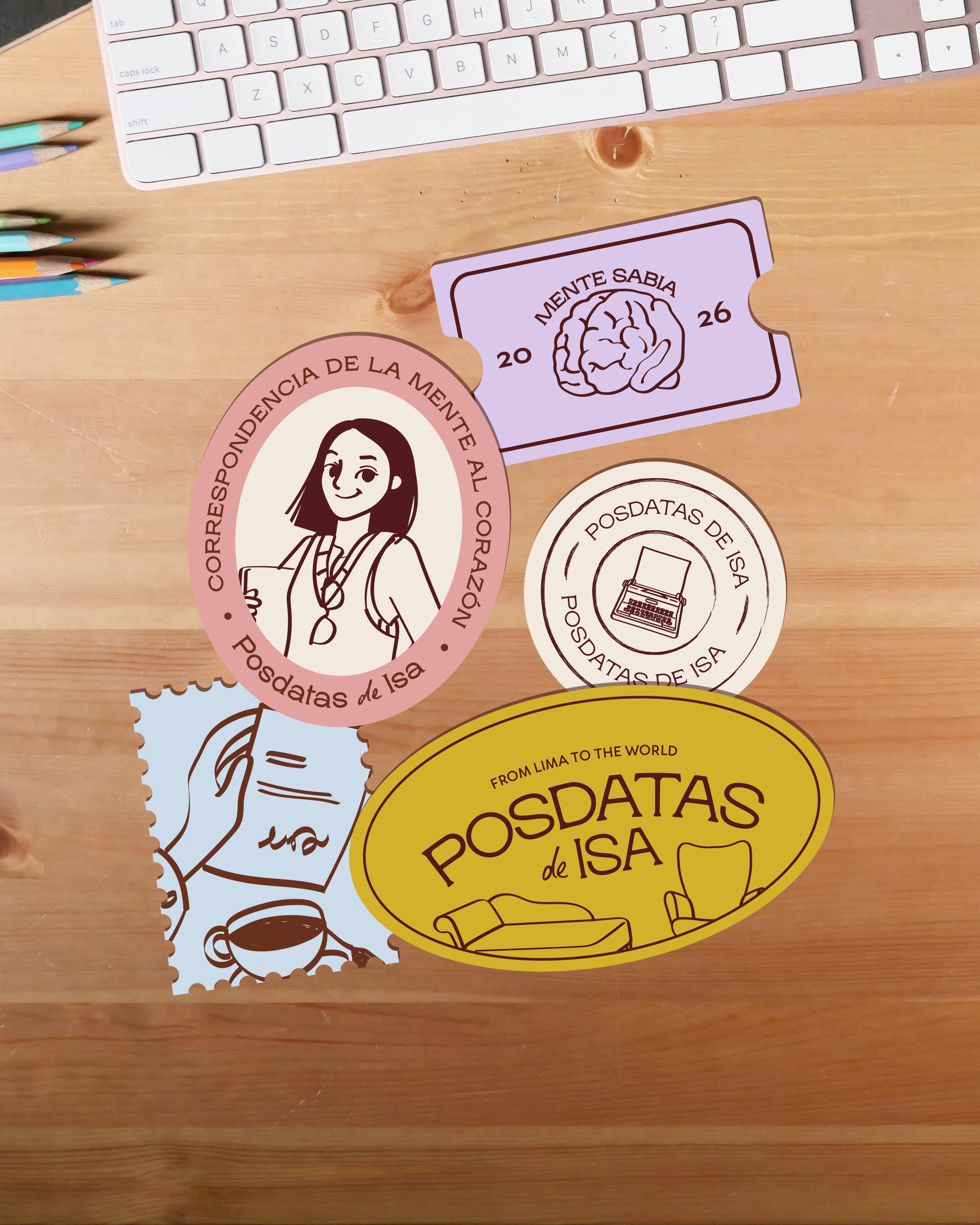
POSDATAS DE ISA →