
POSDATAS DE ISA
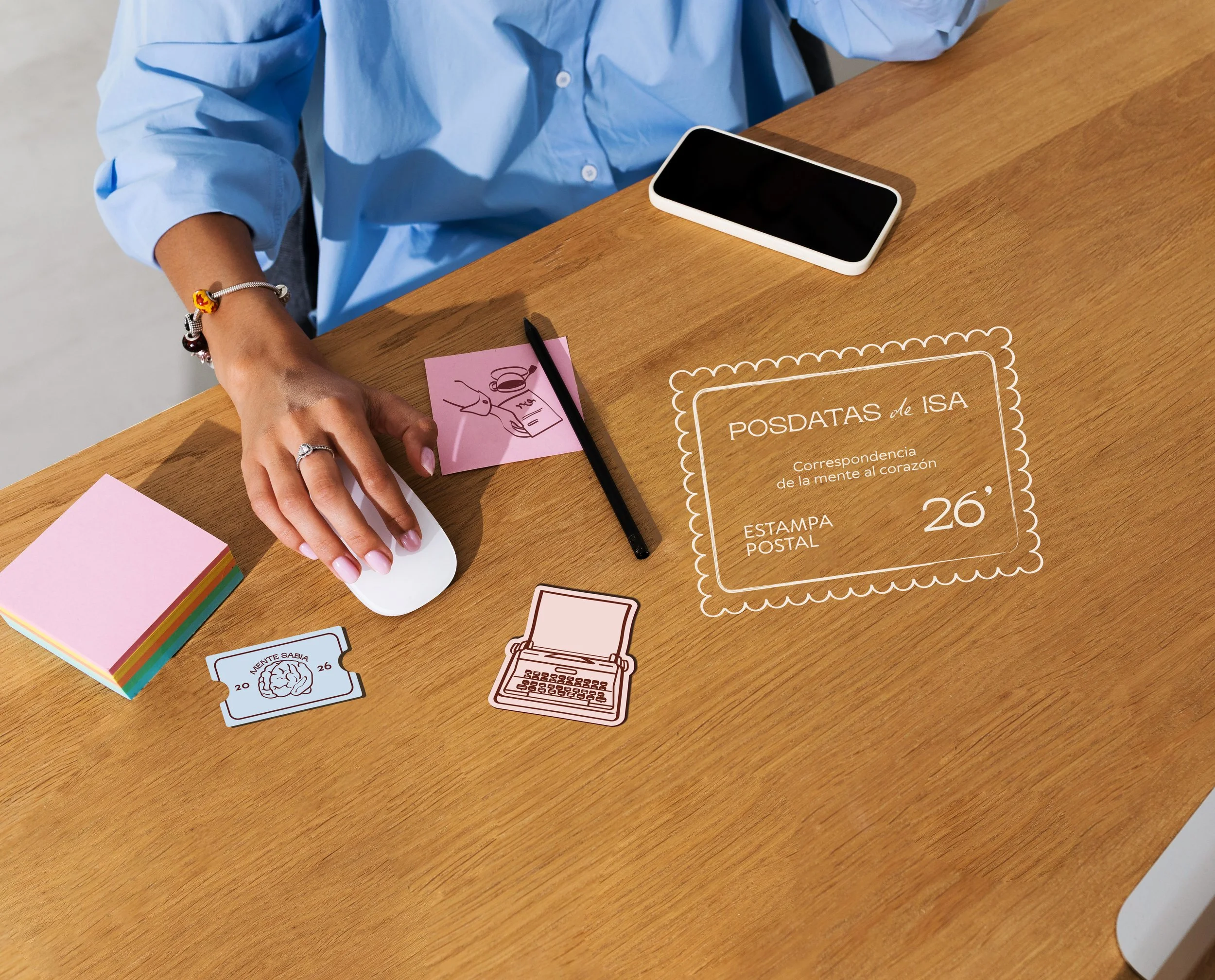
Posdatas de Isa is a personal brand for a psychologist specializing in ACT therapy, focused on bringing together her everyday life and professional practice. The main goal was to create an identity that feels modern, emotional, and easy to engage with, while still reflecting the depth and professionalism of her work. An elegant and professional style with a youthful touch.
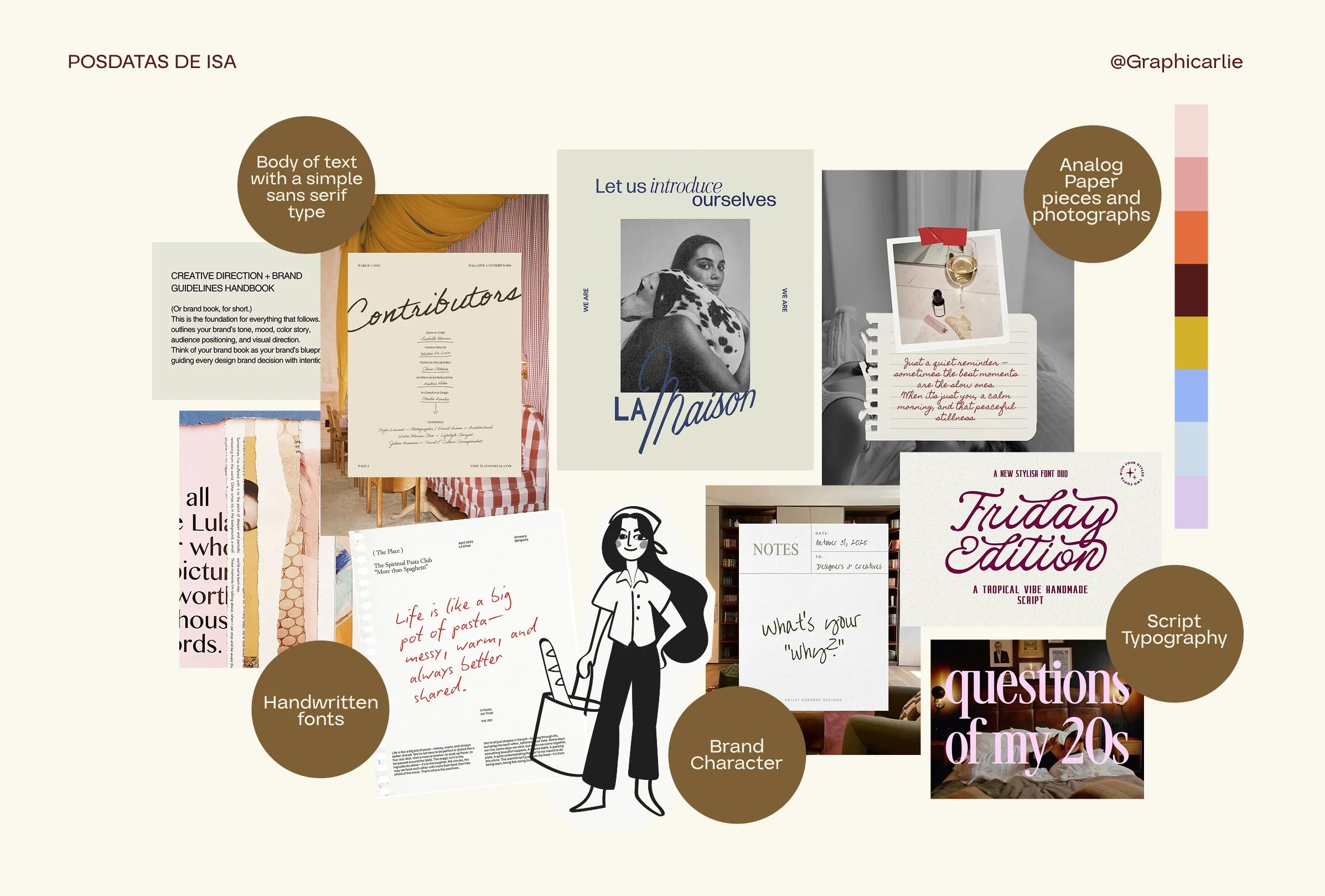
The Moodboard
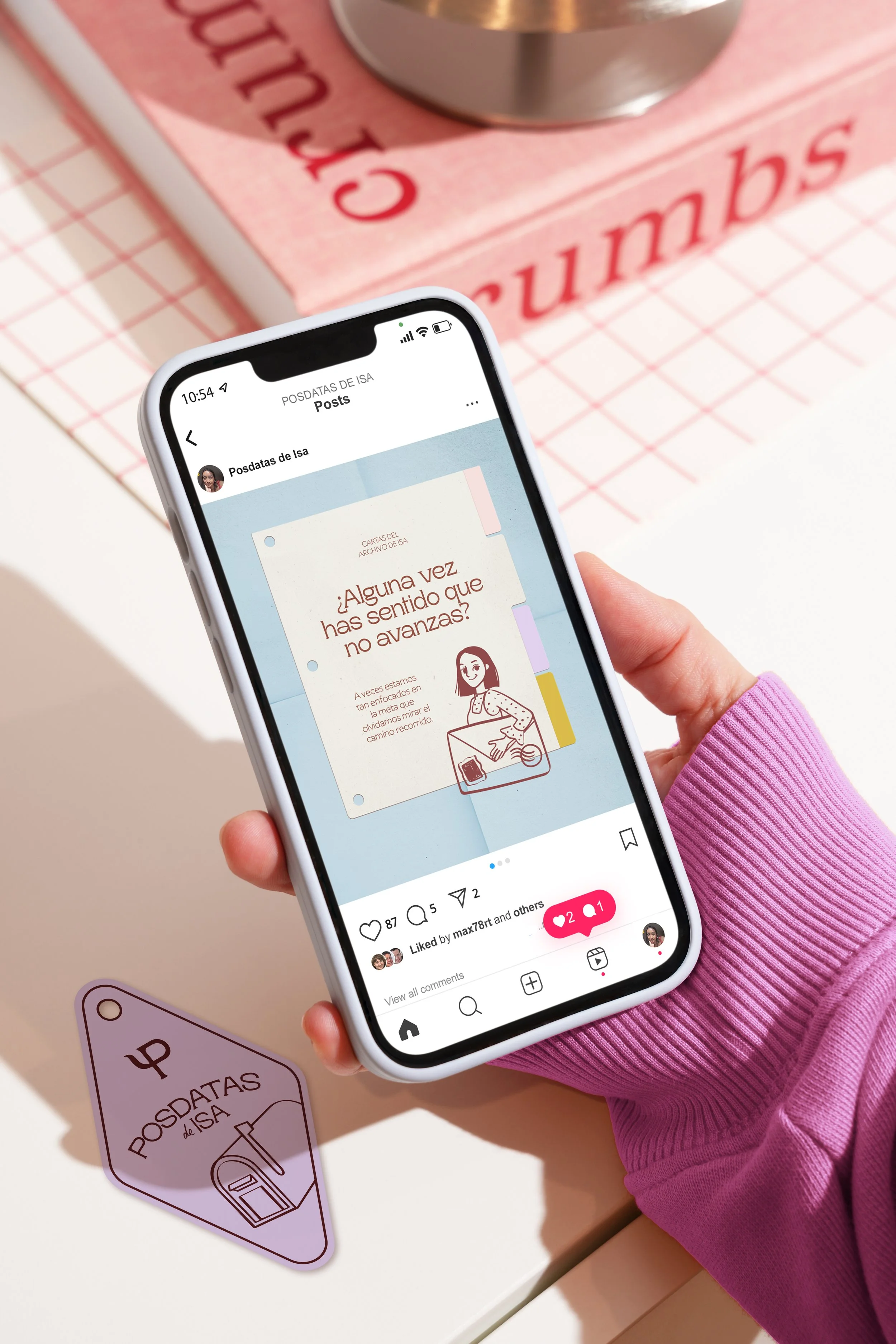
The main concept behind Posdatas de Isa is Letters from the Mind to the Heart. In a world full of fleeting content and digital noise, I wanted the brand to feel like a little pause in someone's day. Rather than creating a personal diary, the idea was to build an intentional correspondence where Isa's everyday experiences become a starting point for reflection, while her professional knowledge helps guide each conversation.
With this concept in mind, the entire identity started revolving around letters, mail, and handwritten advice. I wanted it to feel like receiving a letter from a psychologist you admire, someone who is just as professional as she is warm and approachable.
For JAMMED, I wanted to build a brand that could stand out from the category. The direction combines playful colors and bold typography with a clean, editorial approach, giving the brand a look that feels fun, confident, and a little unexpected.
A chunky, bold logotype gives JAMMED its distinctive personality. The tight lettering makes the name feel compact, confident, and hard to miss.
Deep berry tones, electric bubblegum pink, and warm cream bring a fresh twist to the category. The contrast feels vibrant and playful while keeping the overall identity polished.
Bold typography, abstract fruit shapes, and clean editorial details come together to create a packaging system that feels simple but full of character.
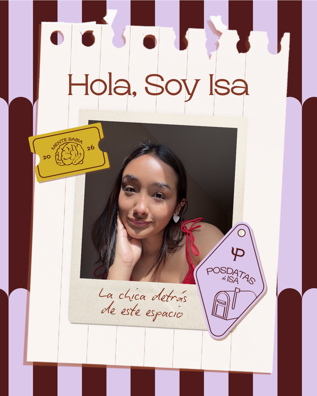
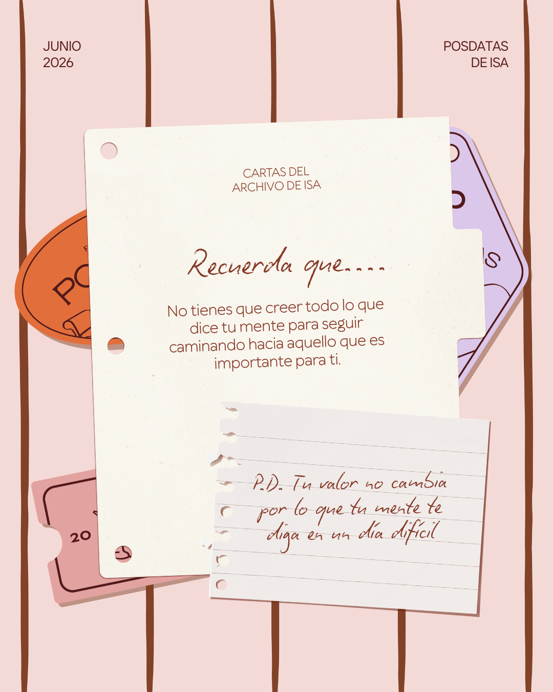
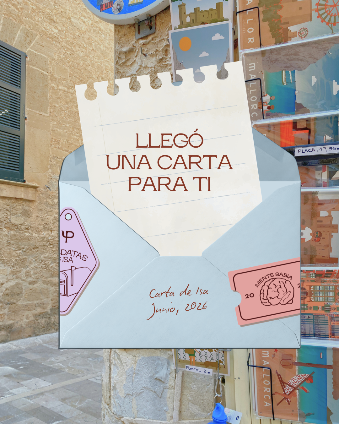
I wanted Posdatas de Isa to feel inspiring, accessible, and easy to understand, especially when discussing more theoretical psychological topics. The main audience was young women, including psychology students and people who are interested in or currently undergoing therapy.
It was also important to step away from the usual visual codes found in the psychology industry, which often lean towards lifestyle vlogs or overly childish illustrated motivational phrases. Instead, I wanted to create something more mature and intentional, with a recognizable visual identity that still feels approachable.
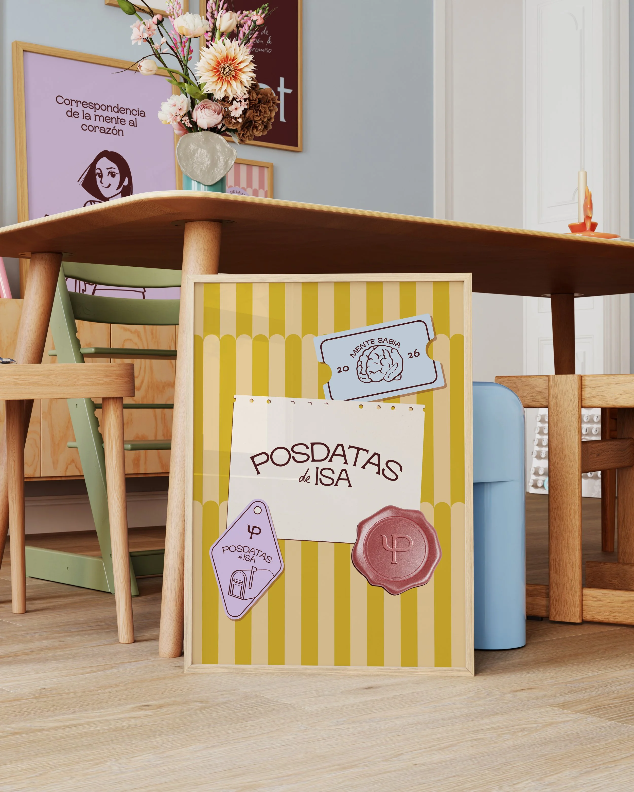
Taking the concept of letters a step further, the brand incorporates paper textures, handwritten patterns, and handmade illustrations inspired by the little doodles you'd find in a letter from a friend. Other visual elements, such as stamps, stickers, and even a fully developed brand character, help bring this concept to life, adding personality and reflecting the care that goes behind Isa's work.
Check out more projects!

L’IRON →

THE FILM CLUB →