
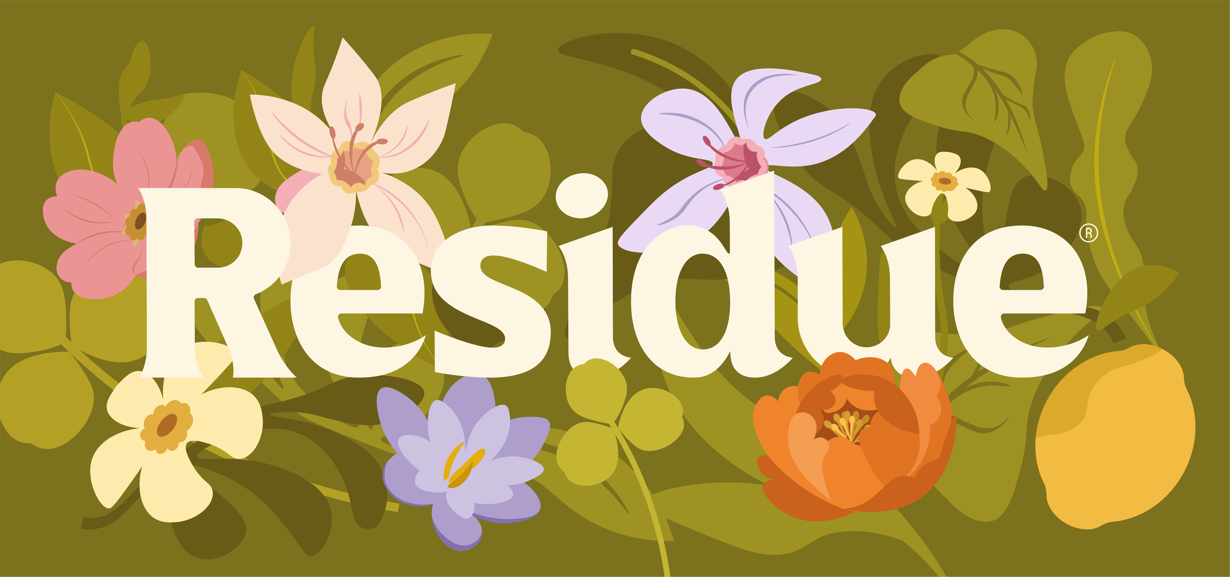
RESIDUE
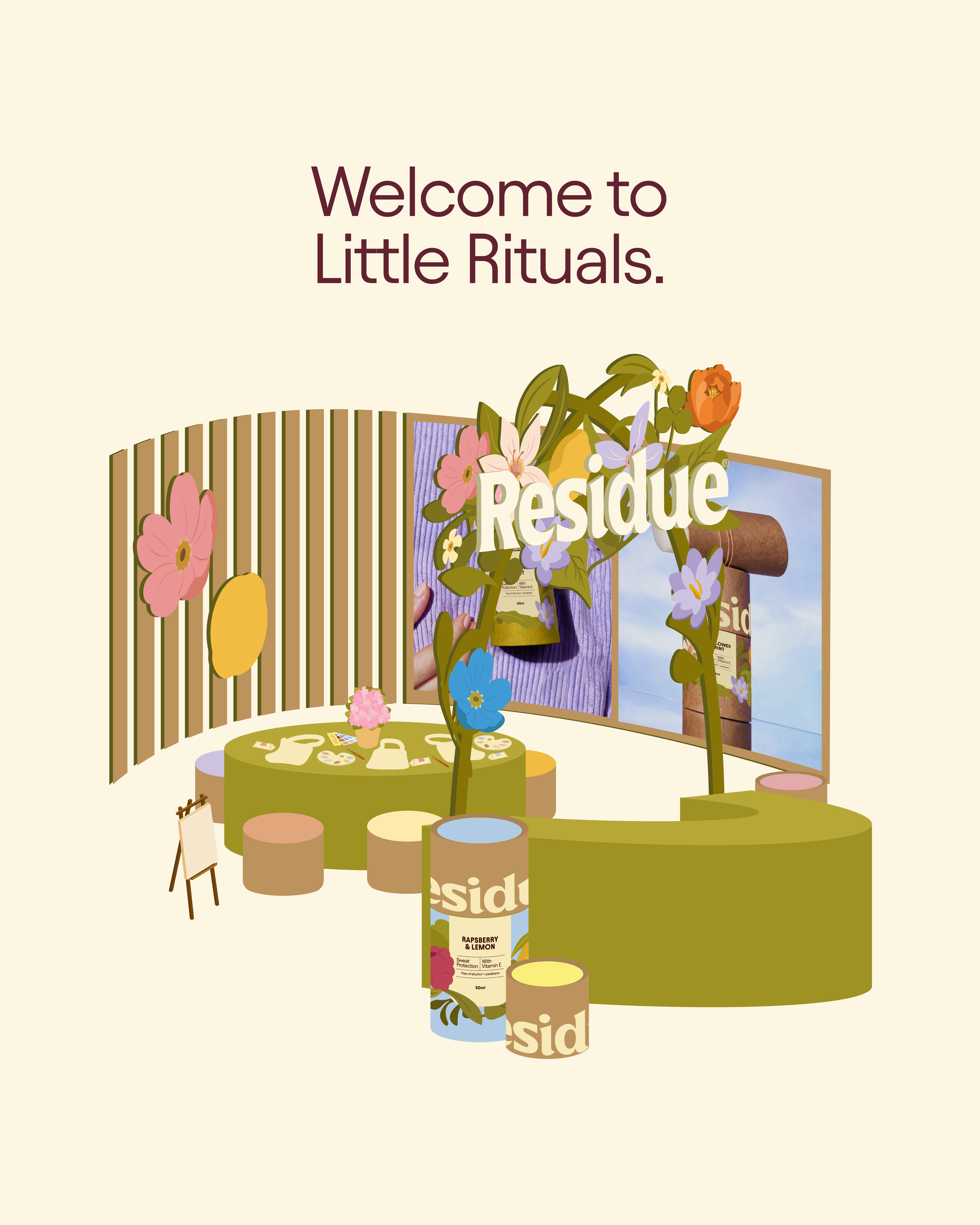
Residue is a sustainable deodorant brand designed to celebrate everyday rituals through thoughtful design. Inspired by nature's imperfect beauty, this brand identity combines warm typography, vectorial botanic illustrations, and earthy colors to create a visual language that feels calm, joyful, and authentic.
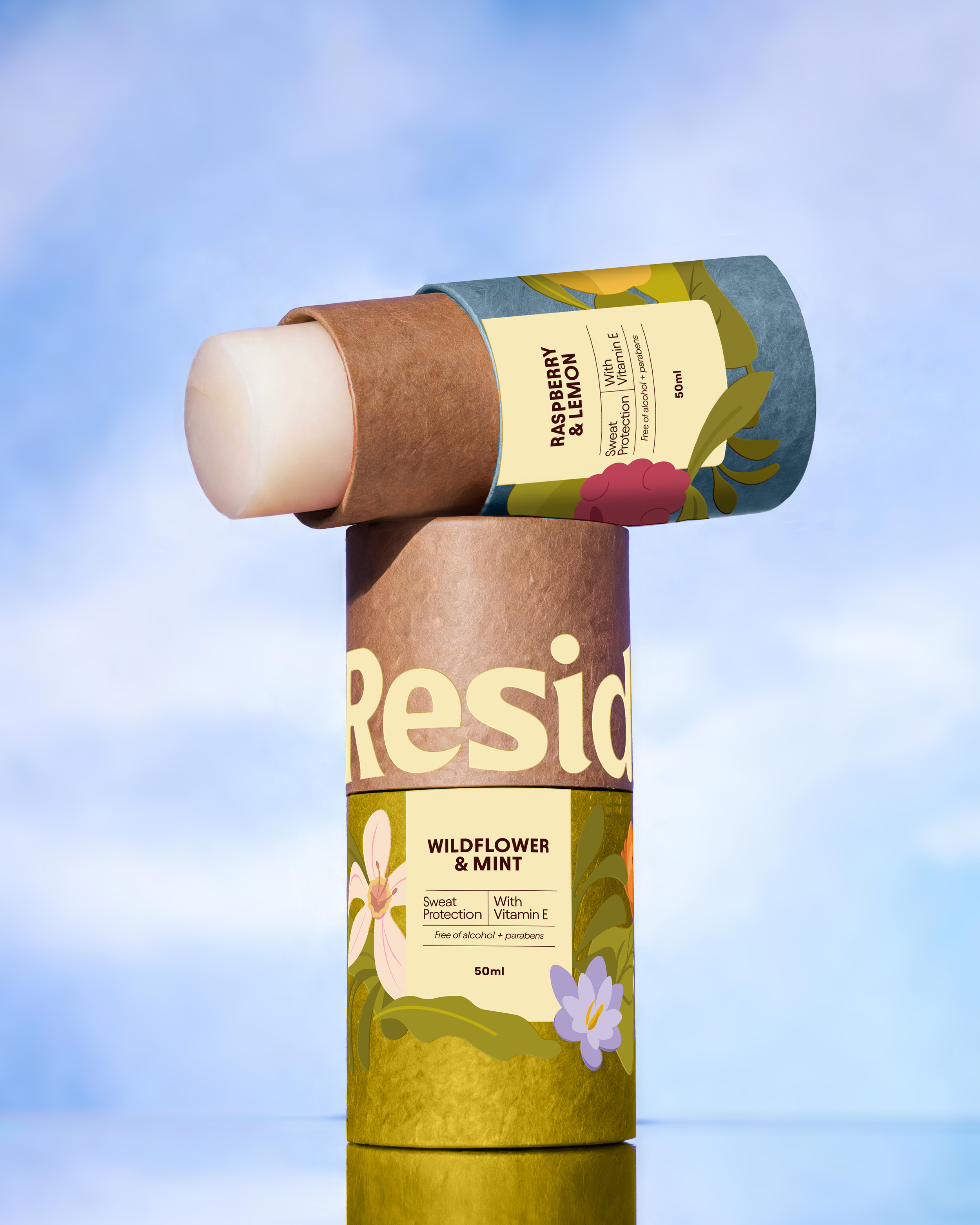
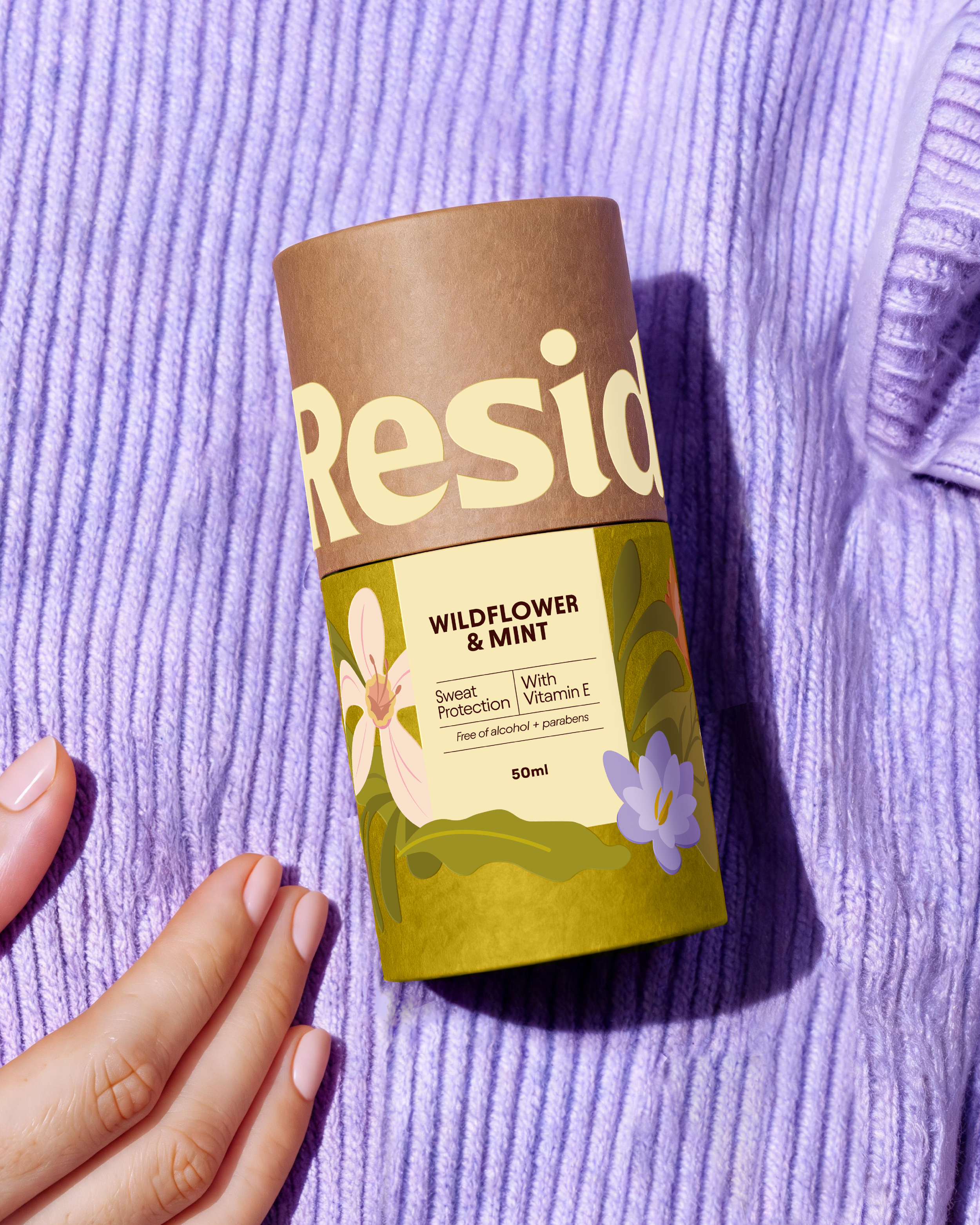
The main concept behind Residue is Little Rituals, elevating an everyday product from a purely functional category into a more intentional, beauty-inspired experience.
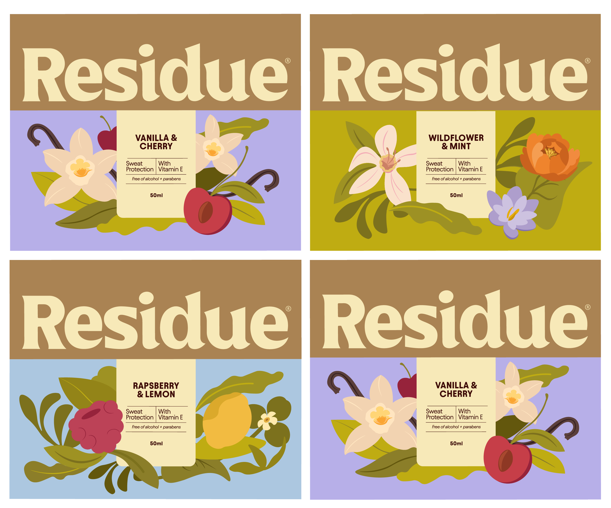
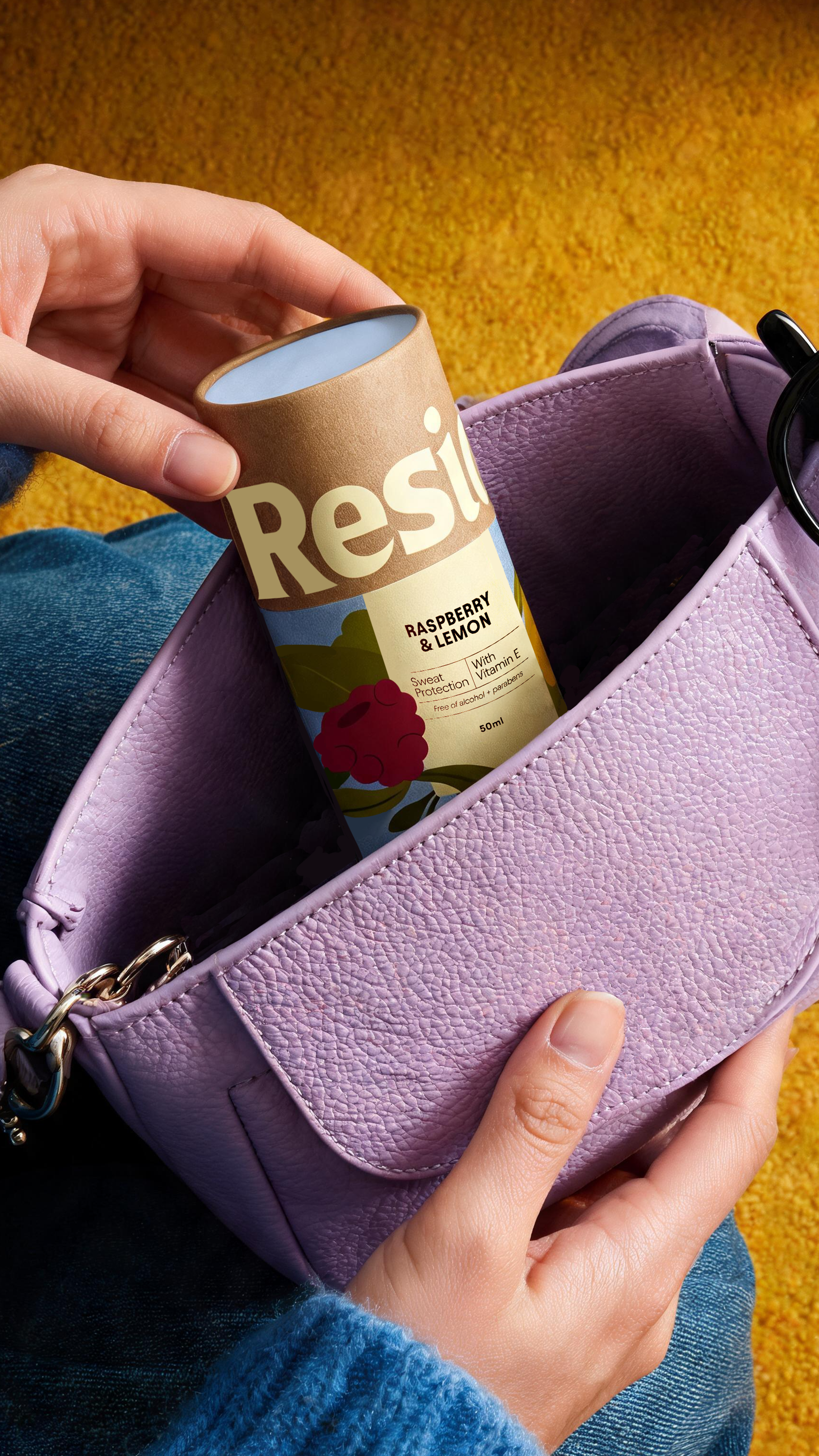
Each tube features a distinct fragrance and set of ingredients, which I incorporated into each label design while keeping the overall packaging cohesive and recognizable. The goal was to create a packaging system that could eventually grow into a collection of products that are just as visually appealing as they are environmentally friendly.
RESIDUE’S label system

For JAMMED, I wanted to build a brand that could stand out from the category. The direction combines playful colors and bold typography with a clean, editorial approach, giving the brand a look that feels fun, confident, and a little unexpected.
A chunky, bold logotype gives JAMMED its distinctive personality. The tight lettering makes the name feel compact, confident, and hard to miss.
At its core, Residue is designed to feel trustworthy, grounded, and full of life. A strong, timeless serif typeface gives the logo a sense of stability and credibility, while the botanical illustrations, organic shapes, and earthy color palette introduce a feeling of freedom, wellbeing, and connection to the natural world.
The result is a brand that feels both dependable and expressive, bringing a little more joy and intention into everyday routines.
Deep berry tones, electric bubblegum pink, and warm cream bring a fresh twist to the category. The contrast feels vibrant and playful while keeping the overall identity polished.
Bold typography, abstract fruit shapes, and clean editorial details come together to create a packaging system that feels simple but full of character.
Check out more projects!
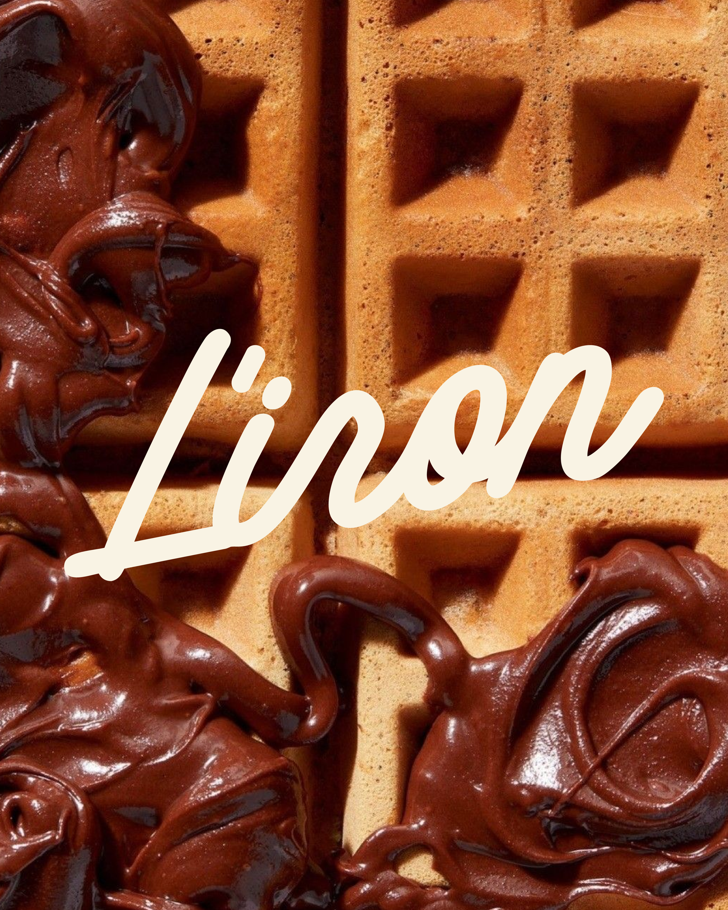
L’IRON →
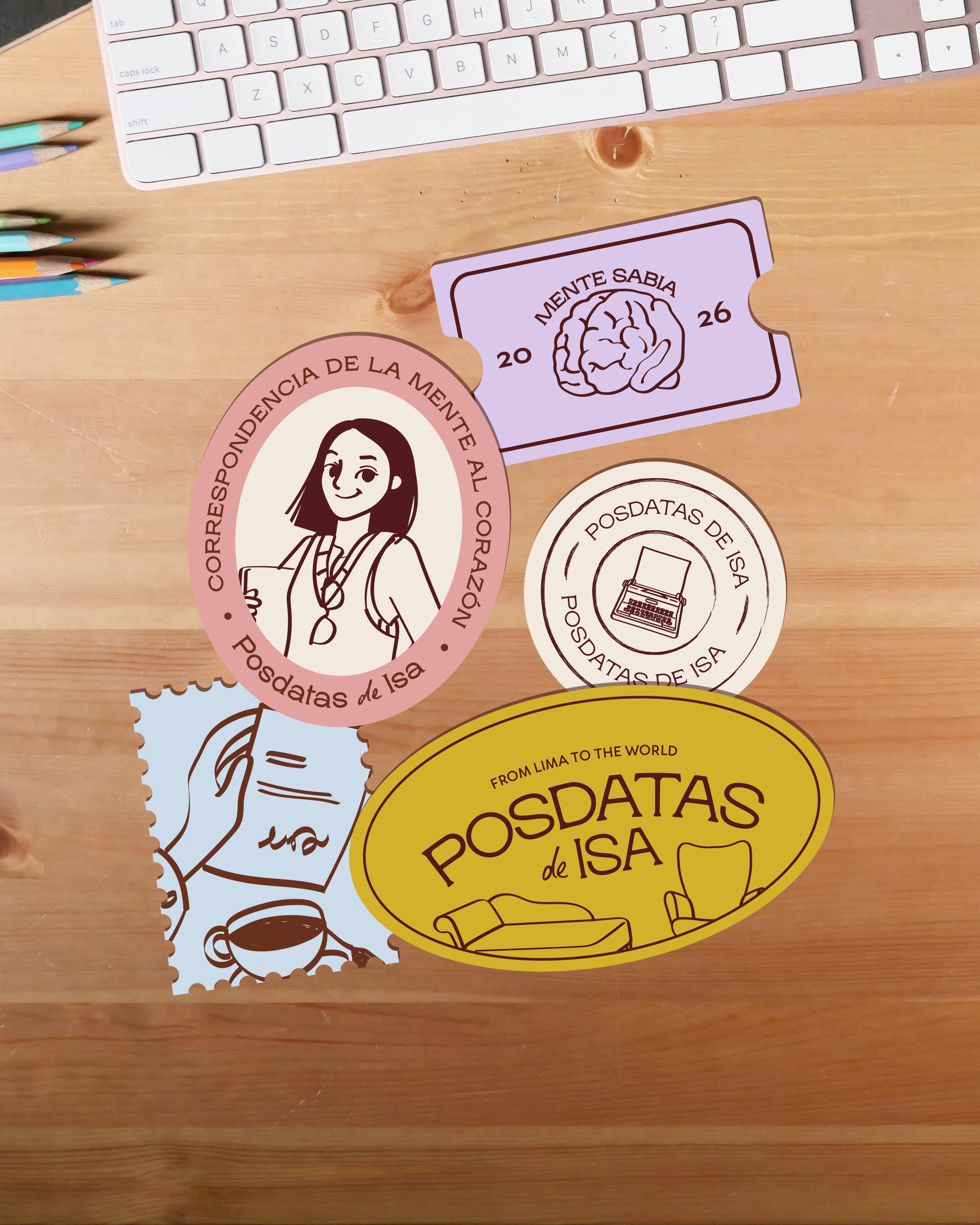
POSDATAS DE ISA →