


For JAMMED, I wanted to build a brand that could stand out from the category. The direction combines playful colors and bold typography with a clean, editorial approach, giving the brand a look that feels fun, confident, and a little unexpected.
A chunky, bold logotype gives JAMMED its distinctive personality. The tight lettering makes the name feel compact, confident, and hard to miss.
The Film Club
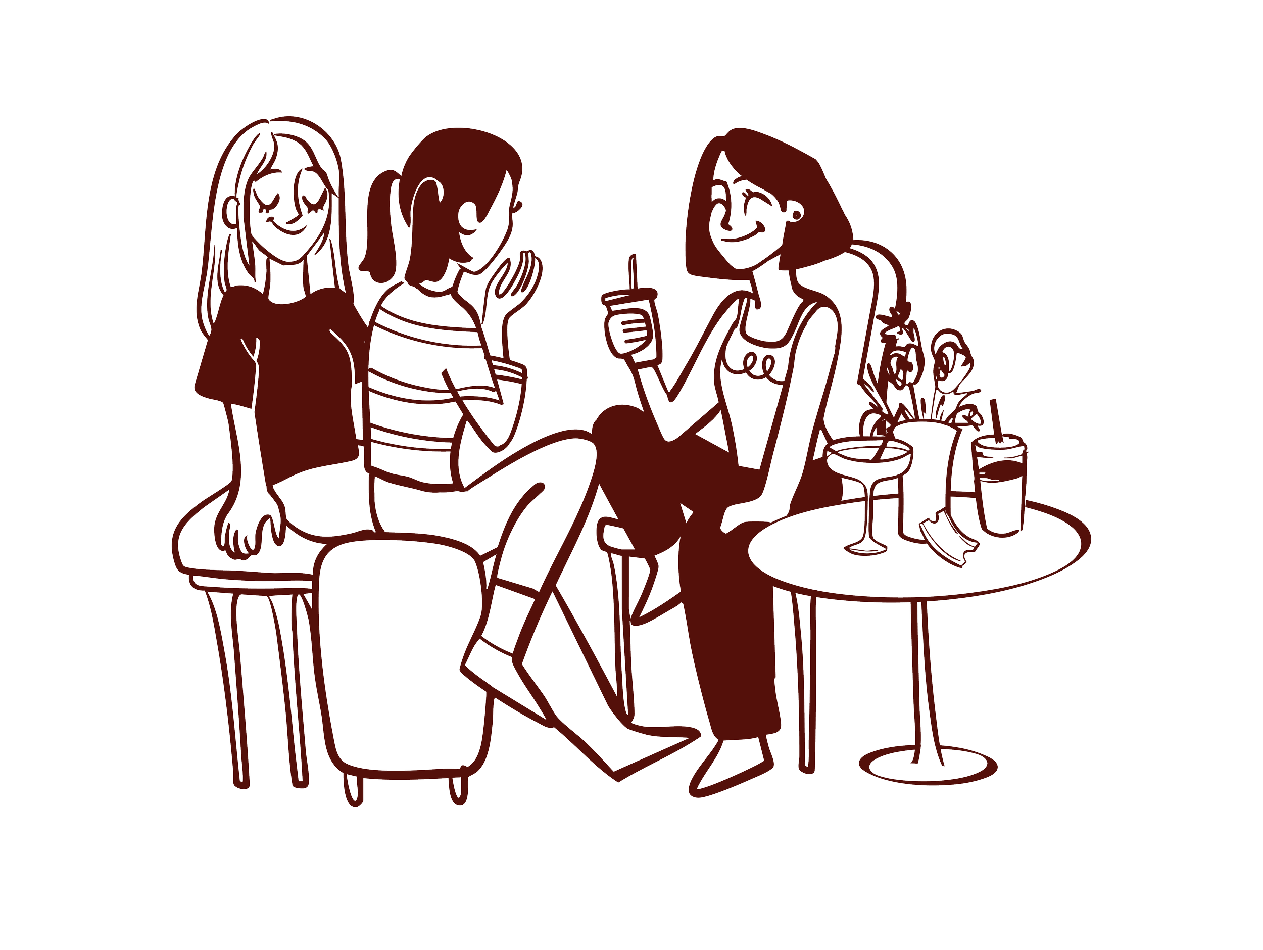
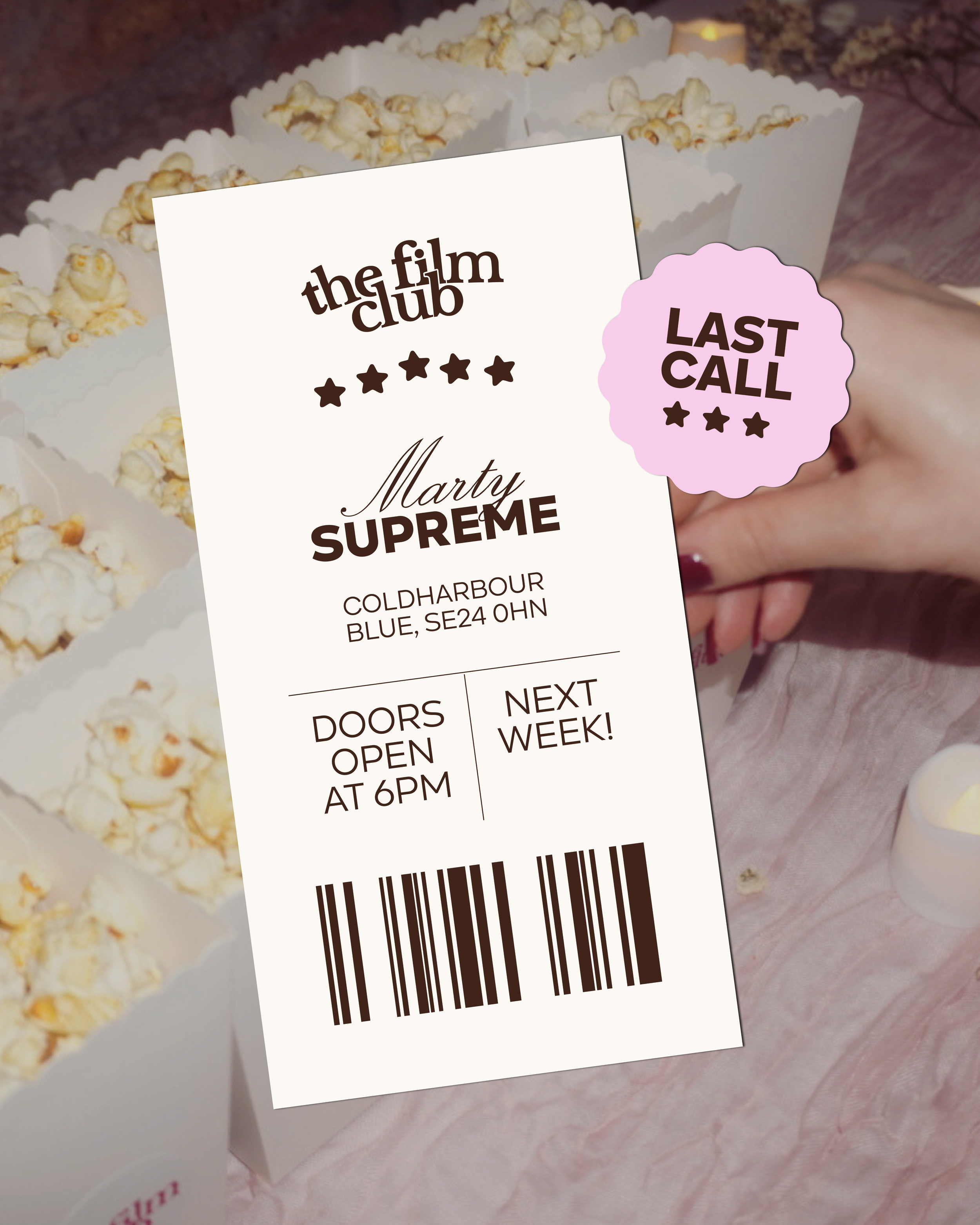
The Film Club (TFC.) is a curated, London-based community for women, curious viewers, and lifelong cinephiles. The goal of this project was to create a comprehensive visual identity refresh, bringing new life to their social media presence while preserving their existing typography and core brand colors.
I worked on a series of distinctive, editorial-inspired social media compositions and templates, covering different types of content, from Film of the Month features to event recaps. The goal was to create a more cohesive and recognizable visual presence while giving the brand enough flexibility to communicate its different activities and connect with its community.
At its core, TFC. is all about community and inclusion. With this in mind, I developed a set of illustrations designed to reflect the welcoming, fun, and approachable nature of the club, while celebrating the connection between women who share a love for cinema.
Deep berry tones, electric bubblegum pink, and warm cream bring a fresh twist to the category. The contrast feels vibrant and playful while keeping the overall identity polished.
Bold typography, abstract fruit shapes, and clean editorial details come together to create a packaging system that feels simple but full of character.
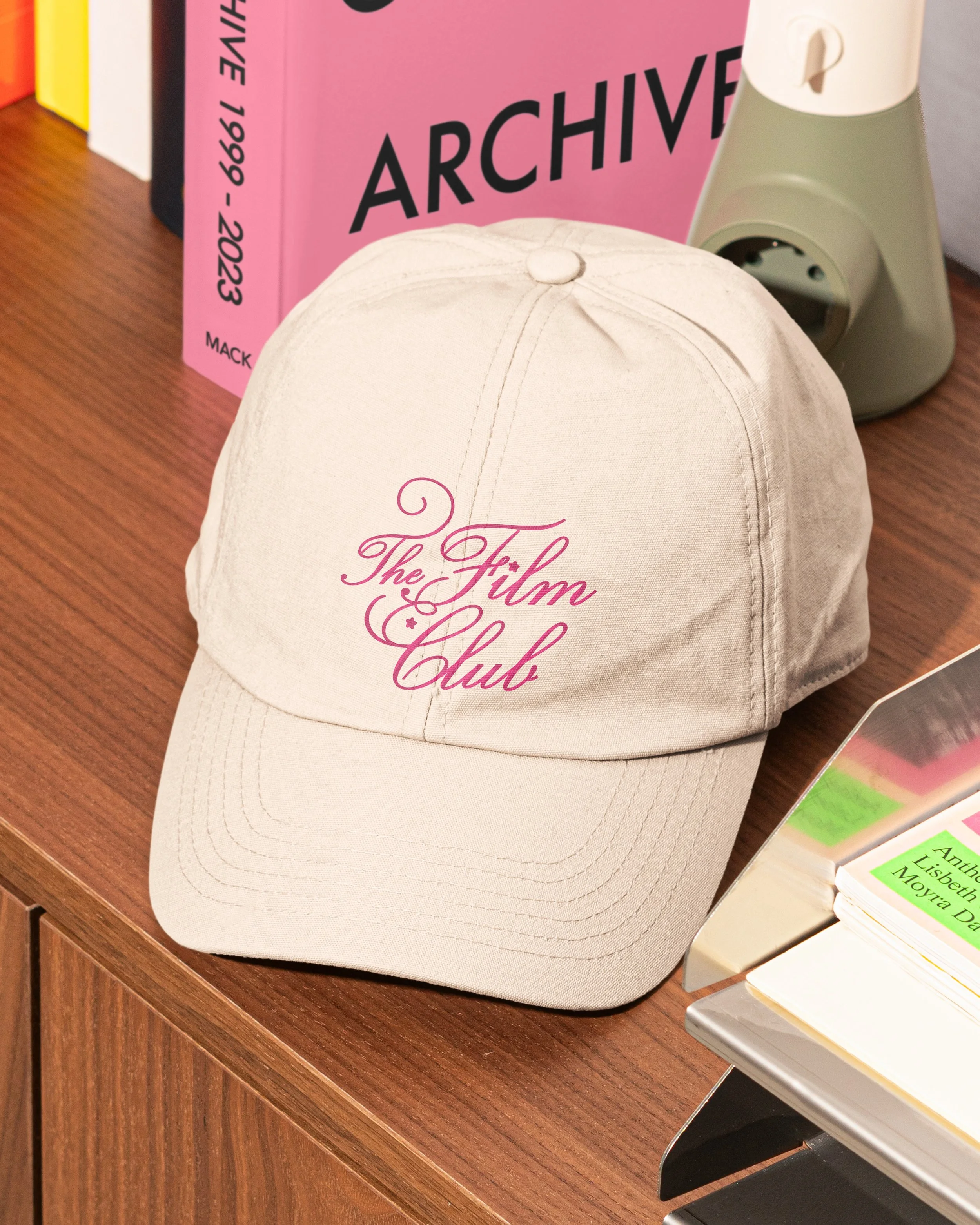
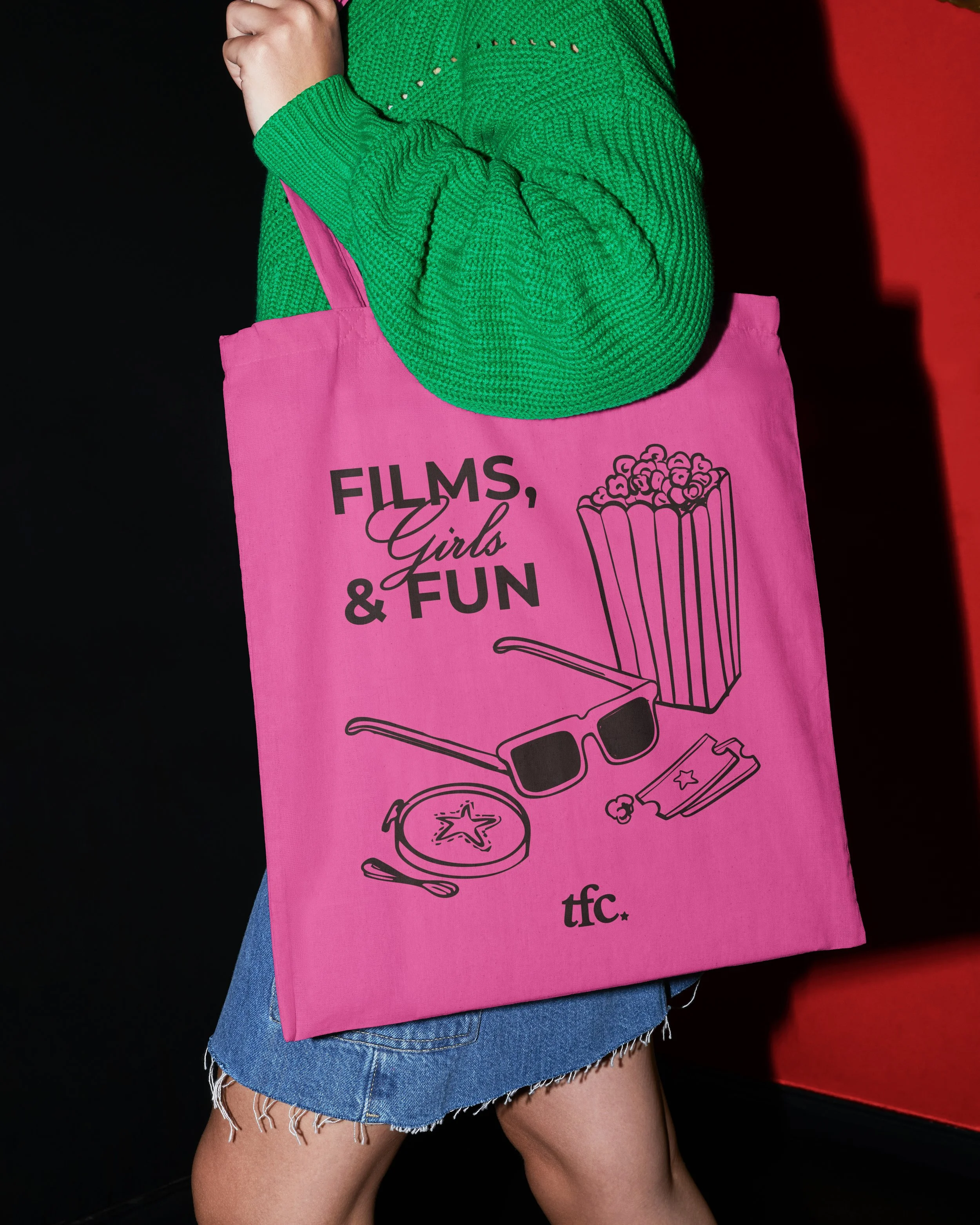
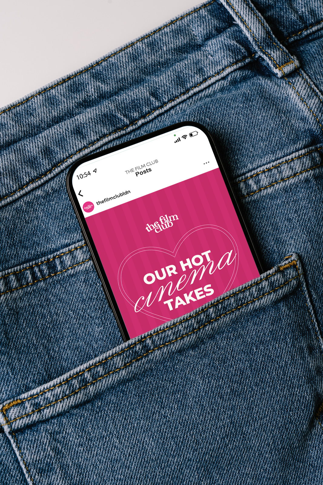
I wanted all the elements of the brand to feel cohesive, playful, and full of personality. After all, TFC. is a club built around the love of movies and female friendships! To bring this idea further, I created a variety of stickers and merchandise designs that extend the brand's visual identity beyond social media and into the community itself.


Meet Sophie
As an additional part of the project, I also developed a character for TFC.'s sister page, Soft Serve. Meet Sophie! A playful character designed to bring personality to the page, featuring her signature director's chair and a little ice cream in hand. The goal was to create a recognizable character that could give Soft Serve its own visual personality while still feeling connected to the creative world of The Film Club.

Check out more projects!
L’IRON →
RESIDUE →