
JAMMED
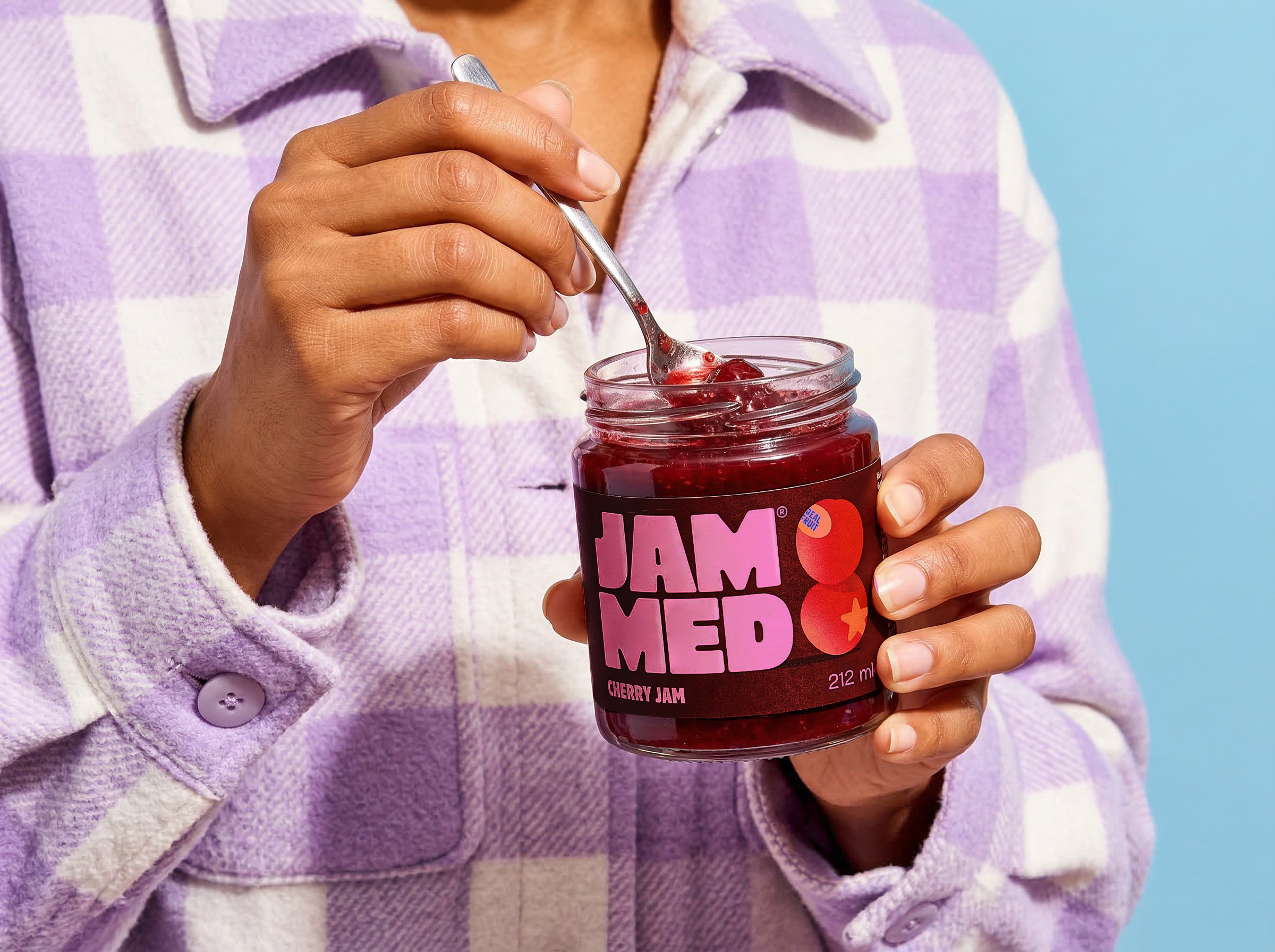
JAMMED is a fresh, playful take on traditional fruit jams. The idea was to move away from the traditional, rustic look we usually associate with jam and create something that feels bold, modern, and just as good to look at as it is to eat.
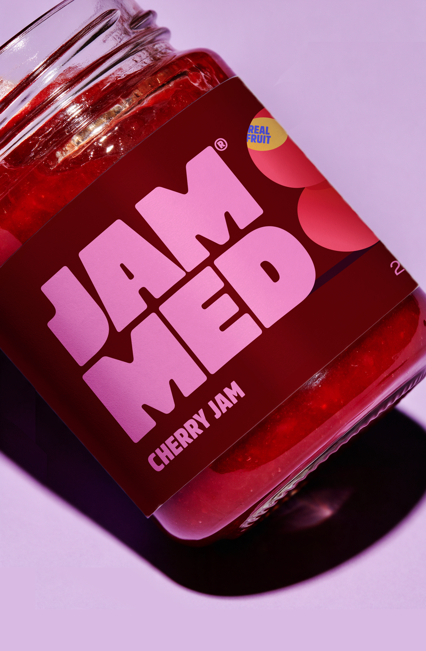
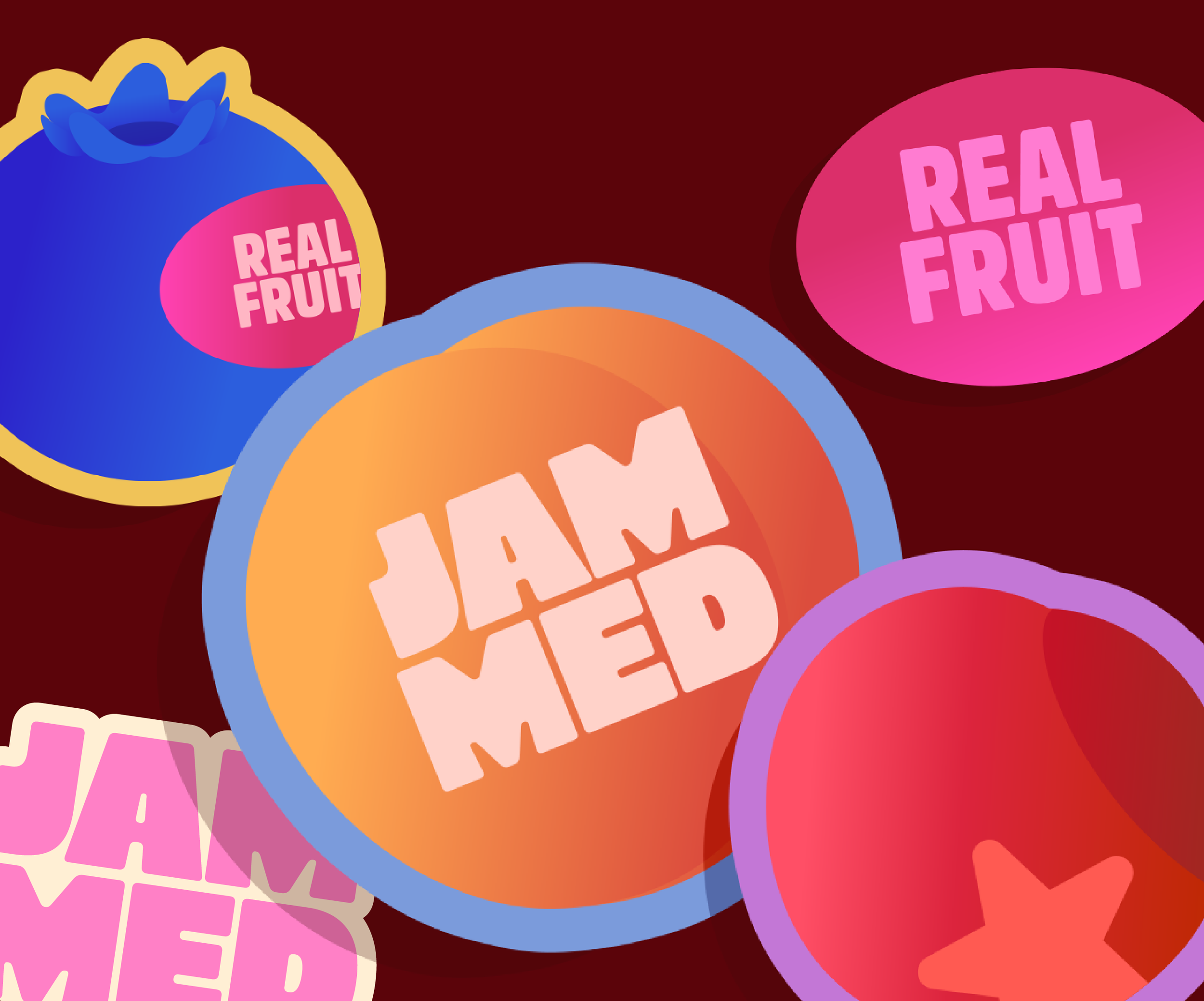
For JAMMED, I wanted to build a brand that could stand out from the category. The direction combines playful colors and bold typography with a clean, editorial approach, giving the brand a look that feels fun, confident, and a little unexpected.
A chunky, bold logotype gives JAMMED its distinctive personality. The tight lettering makes the name feel compact, confident, and hard to miss.
Stickers
For JAMMED, I wanted to build a brand that could stand out from the category. The direction combines playful colors and bold typography with a clean, editorial approach, giving the brand a look that feels fun, confident, and a little unexpected.
A chunky, bold logotype gives JAMMED its distinctive personality. The tight lettering makes the name feel compact, confident, and hard to miss.
Deep berry tones, electric bubblegum pink, and warm cream bring a fresh twist to the category. The contrast feels vibrant and playful while keeping the overall identity polished.
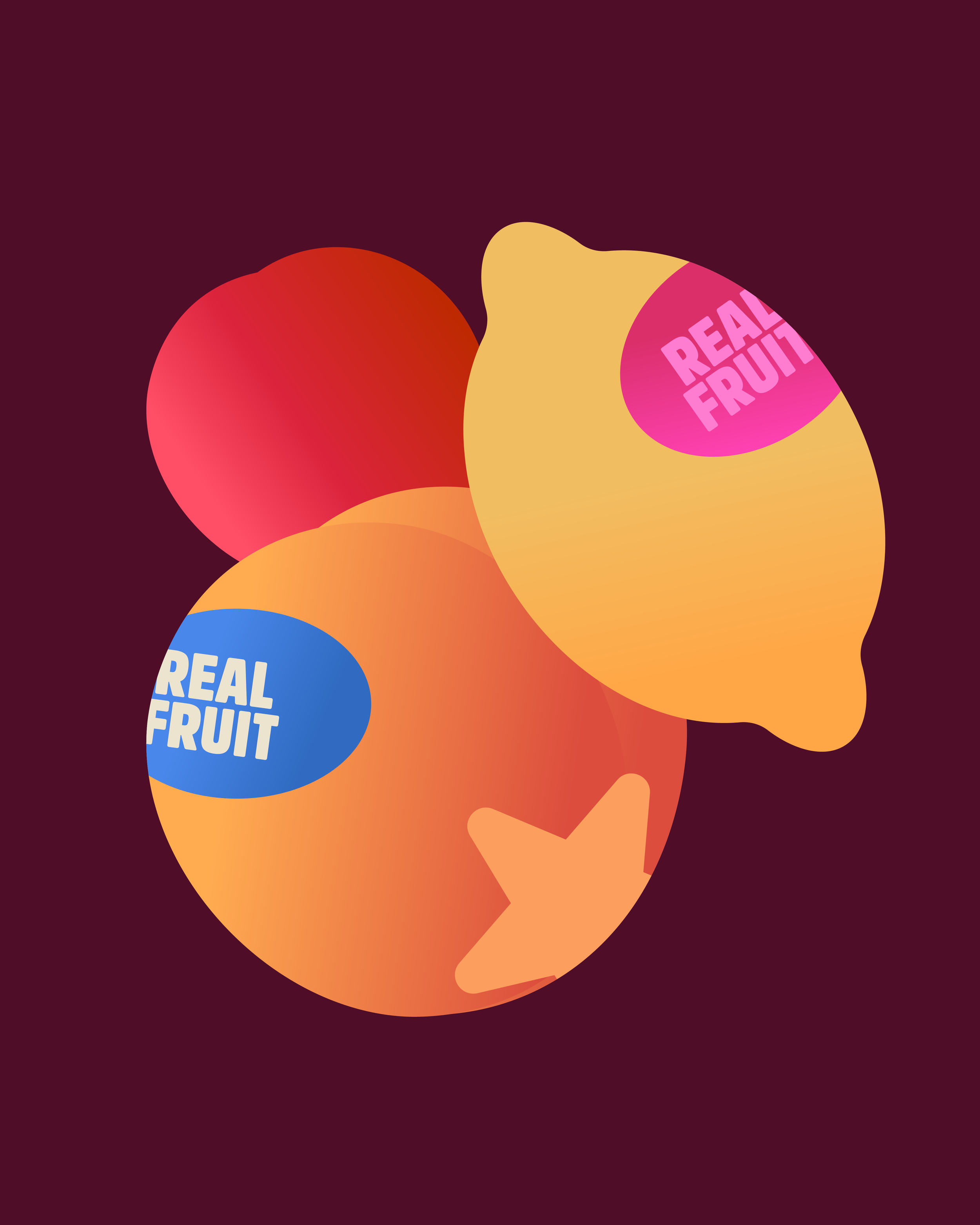
Bold typography, abstract fruit shapes, and clean editorial details come together to create a packaging system that feels simple but full of character.
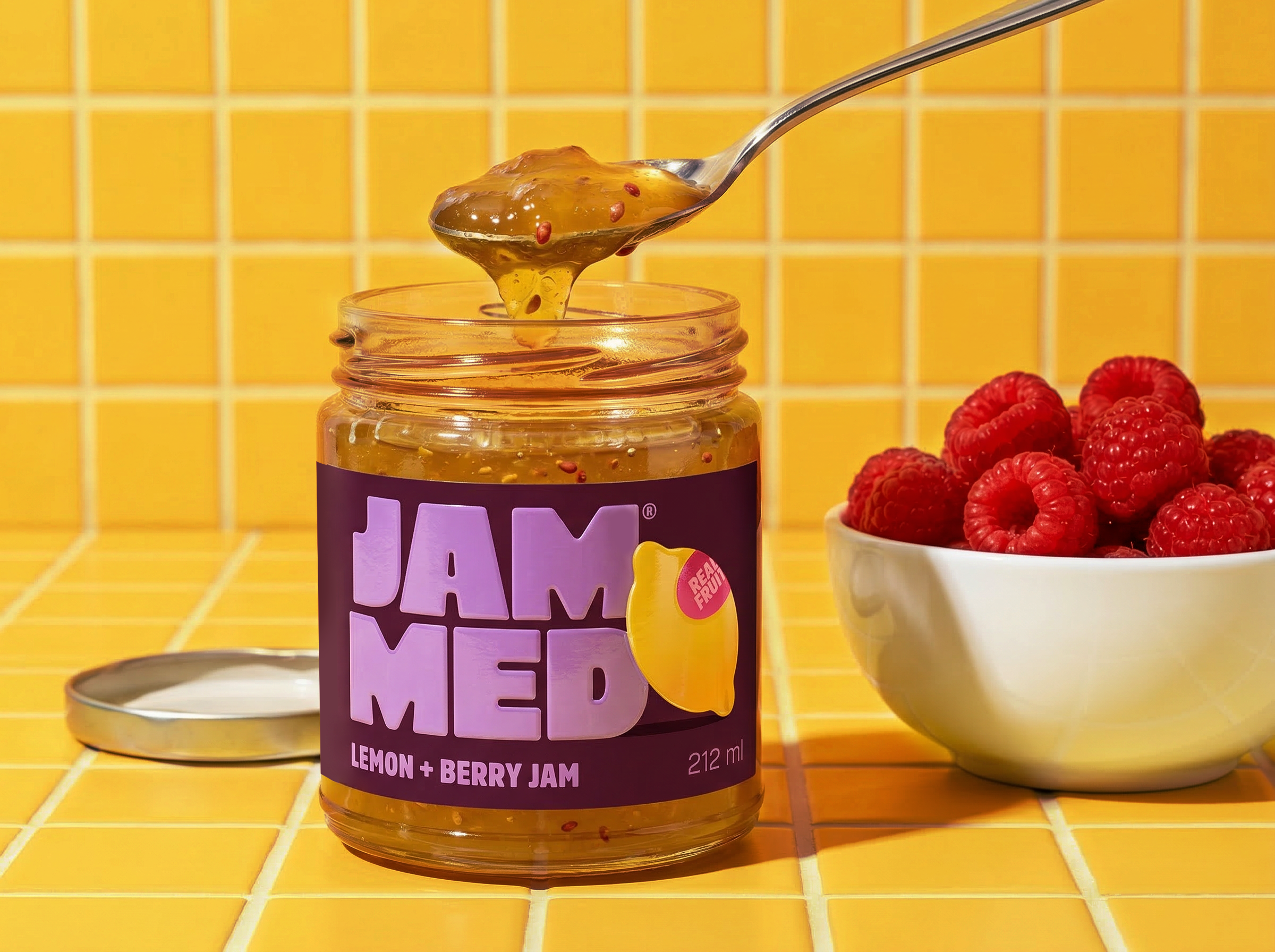
Deep berry tones, electric bubblegum pink, and warm cream bring a fresh twist to the category. The contrast feels vibrant and playful while keeping the overall identity polished.
Bold typography, abstract fruit shapes, and clean editorial details come together to create a packaging system that feels simple but full of character.
Check out more projects!
L’IRON →
POSDATAS DE ISA →