
For JAMMED, I wanted to build a brand that could stand out from the category. The direction combines playful colors and bold typography with a clean, editorial approach, giving the brand a look that feels fun, confident, and a little unexpected.
A chunky, bold logotype gives JAMMED its distinctive personality. The tight lettering makes the name feel compact, confident, and hard to miss.
DAISY CRUMB
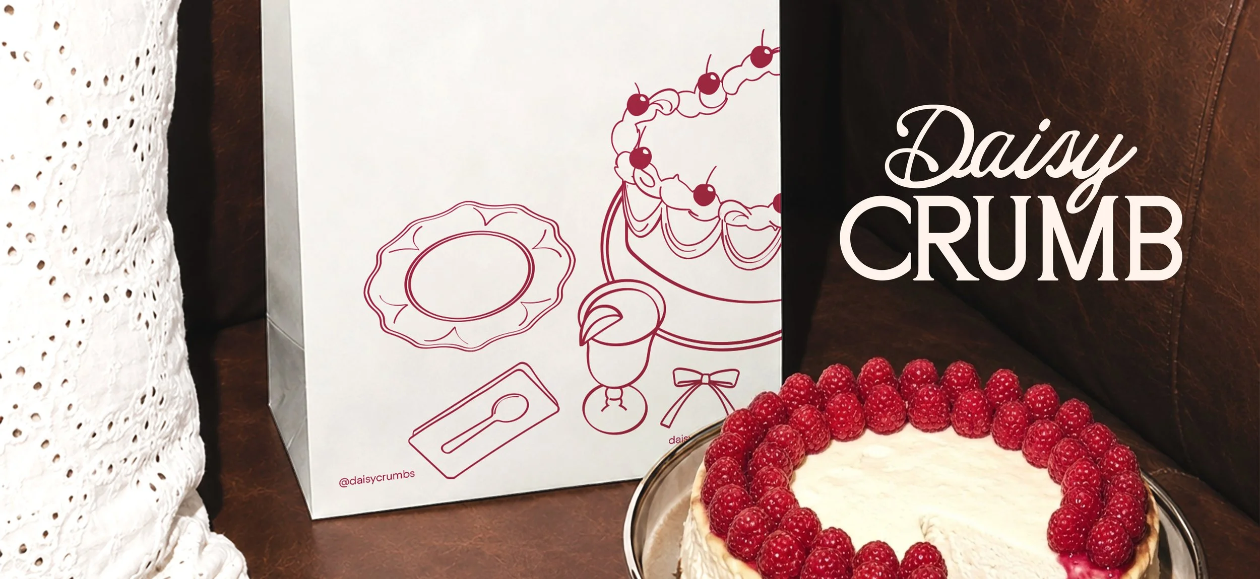
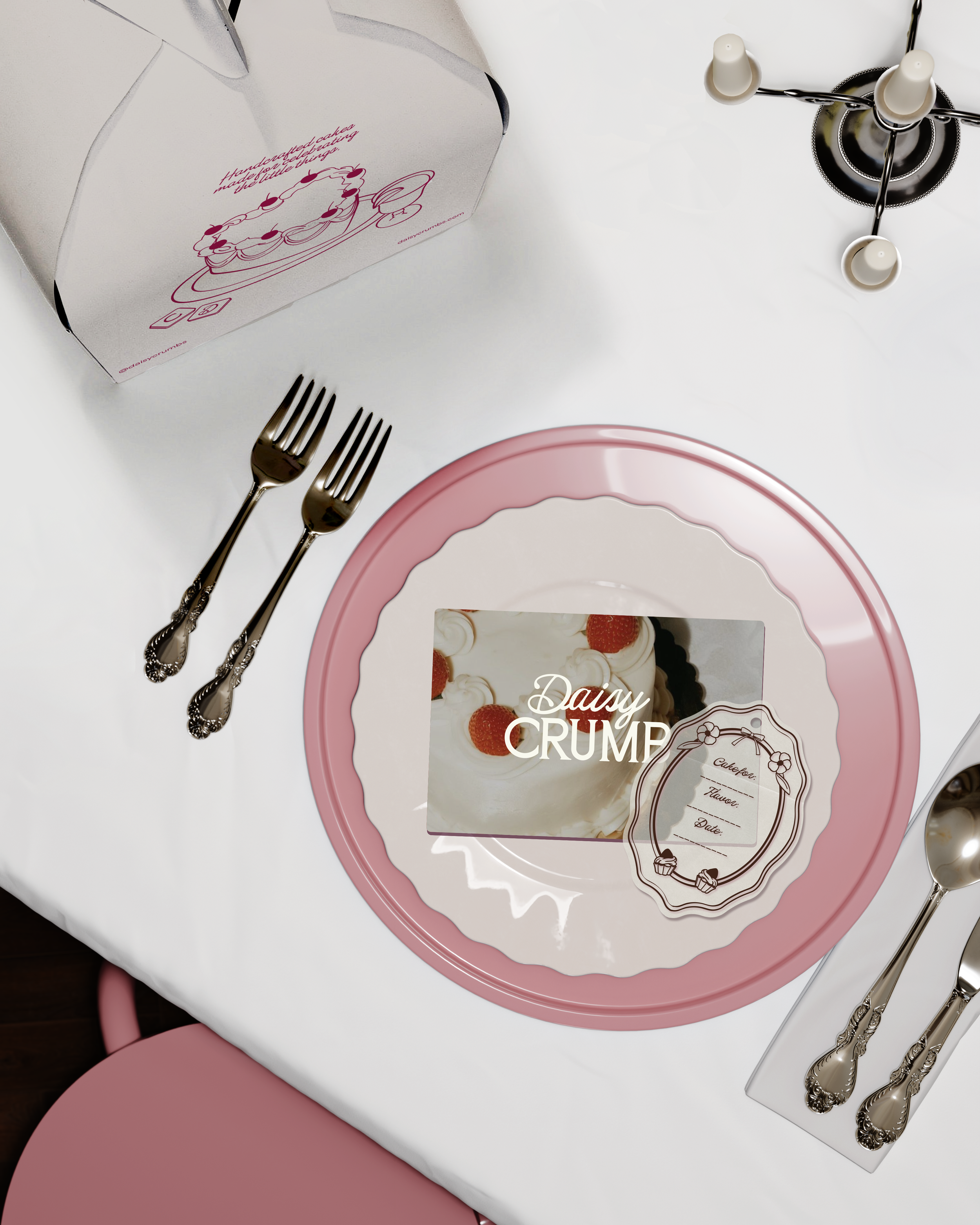
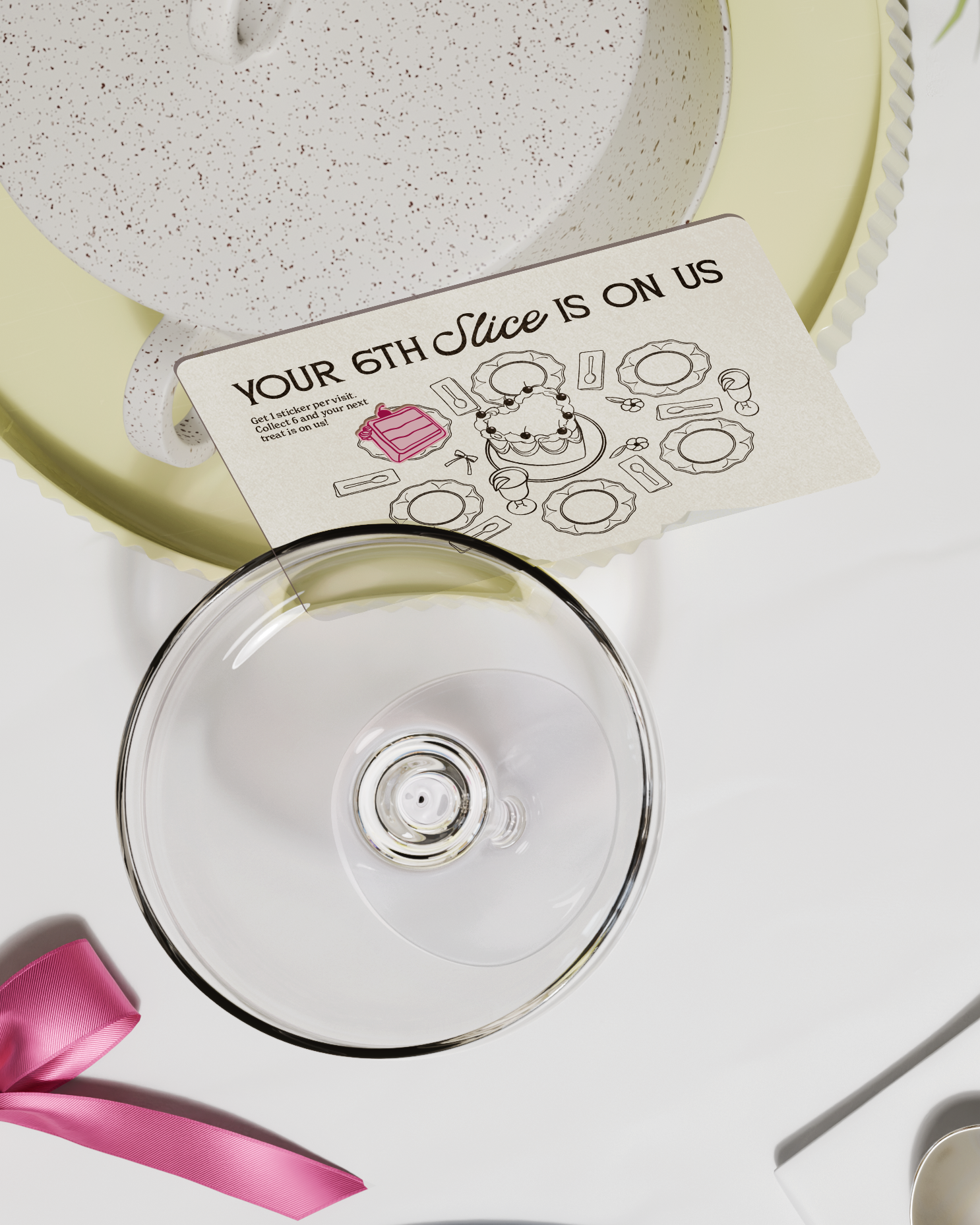
Daisy Crumb is a bakery focused on custom cakes, with a brand identity that brings together the refinement of vintage-inspired aesthetics and the fresh touch of contemporary, clean design. Its visual language combines expressive script typography, and hand-drawn illustrations to create a personality that feels romantic, feminine, and effortlessly refined.
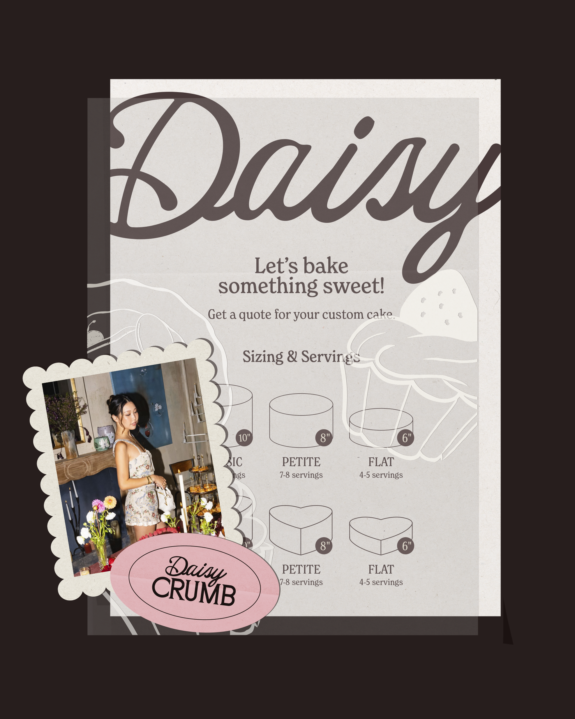
Deep berry tones, electric bubblegum pink, and warm cream bring a fresh twist to the category. The contrast feels vibrant and playful while keeping the overall identity polished.
Bold typography, abstract fruit shapes, and clean editorial details come together to create a packaging system that feels simple but full of character.
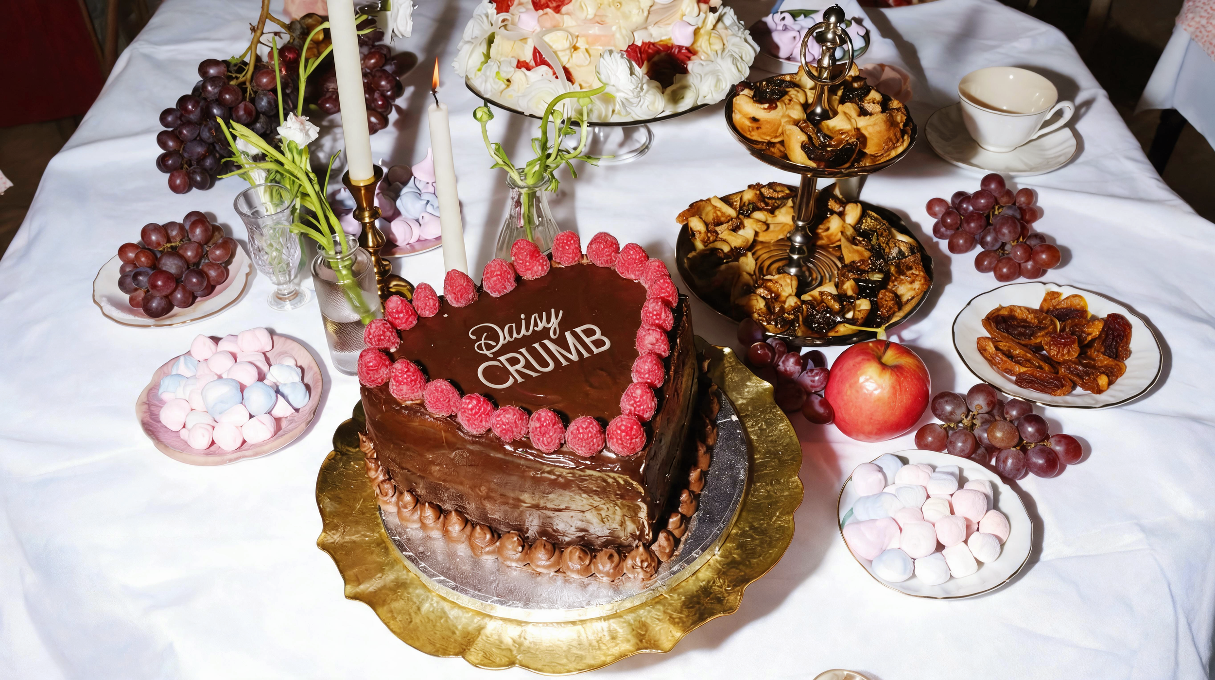
I wanted Daisy Crumb to feel elegant and feminine without becoming overly elaborate or visually overwhelming. Rather than leaning into a specific vintage style, I wanted to capture a more timeless sense of refinement through a combination of typography, color, and illustration.
The pairing of a distinctive editorial script font with a more grounded and rounded typeface creates an interesting balance between expressiveness and stability. Meanwhile, the off-white and dark brown color palette keeps the overall identity warm, understated, and cohesive.
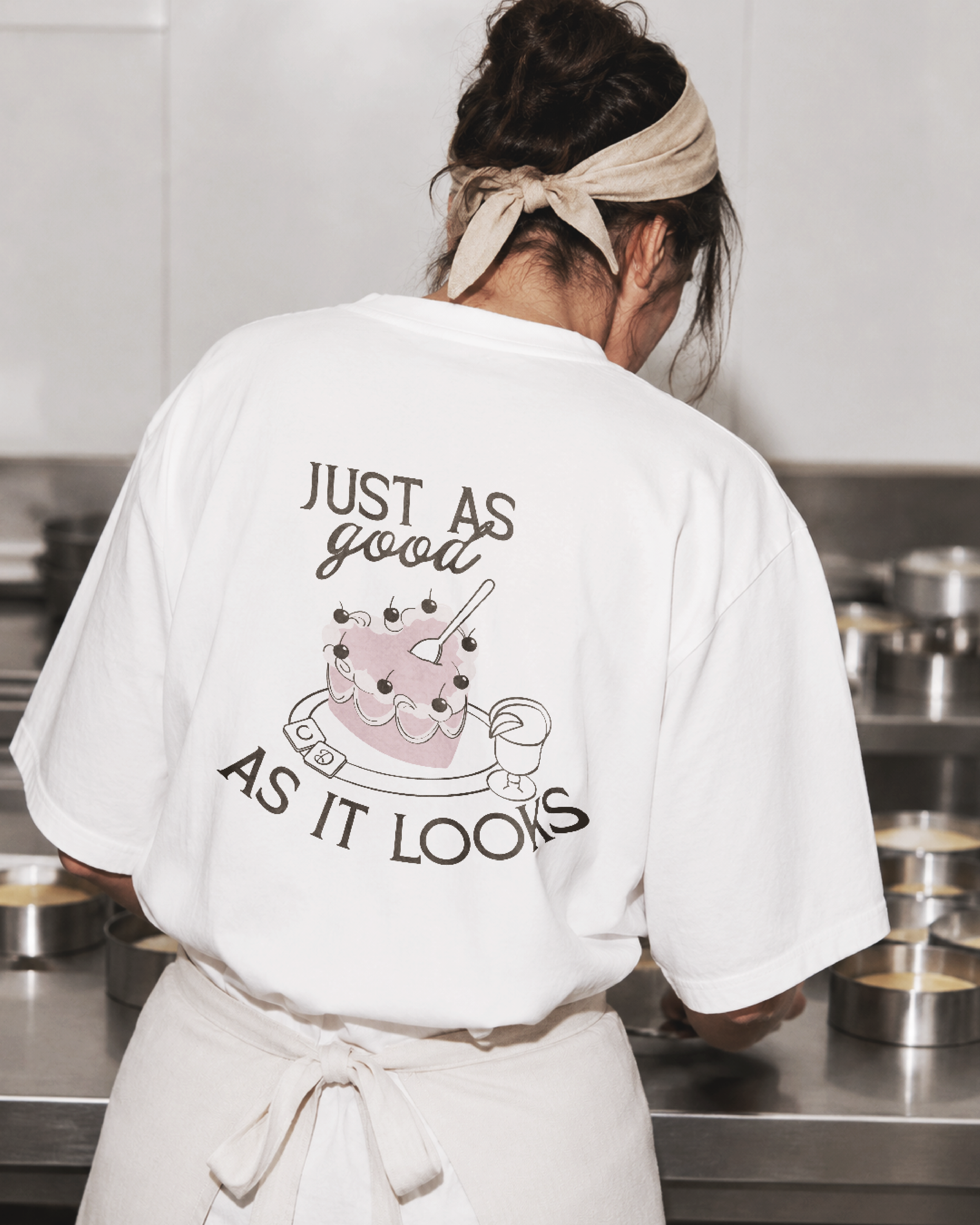
The hand-drawn illustrations bring a more personal and expressive touch to the brand, complementing the typography and adding a sense of character without taking away from its refined aesthetic.
Beyond its visual appeal, I wanted Daisy Crumb to have a playful and confident personality. Being a girly and visually charming brand doesn't mean focusing solely on appearances. The idea is to create cakes that are just as enjoyable to look at as they are to eat, making sure the quality of the product is always as important as its presentation.
Check out more projects!
L’IRON →
POSDATAS DE ISA →